Caribou Coffee Packaging Redesign
- Brand Identity
- Iconography
- Packaging
- Portfolio Architecture
Specialty packaging for specialty coffee

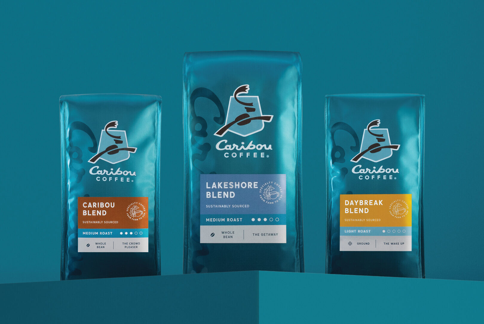
Caribou Coffee has been a Midwest favorite since 1992, inspiring coffee drinkers to embrace life and stay awake for it. As a coffeehouse brand second only in size to Starbucks, Caribou has continued to grow beyond the Upper Midwest. Leadership saw the need to evolve its signature packaging to become more universally approachable, get credit as a leader in premium and specialty coffee, and appeal to younger coffee drinkers.

The solution is designed with restraint for a more mature brand: the identity is more overt, and the portfolio labeling system communicates clearly for ease of navigation. The packaging tells a credible product story, highlighting Caribou’s specialty coffee credential and its unique partnerships throughout the coffee production process.


The simplicity of the packaging expression is elevated through materiality, allowing it to be disruptive on shelf. The gradient treatment of the brand color was developed as an innovative production approach, achieved through a collaborative R&D effort across a range of print partners.


