Caribou Coffee Packaging 2019
- Brand Identity
- Iconography
- Packaging
- Portfolio Architecture
Creating a brand people love
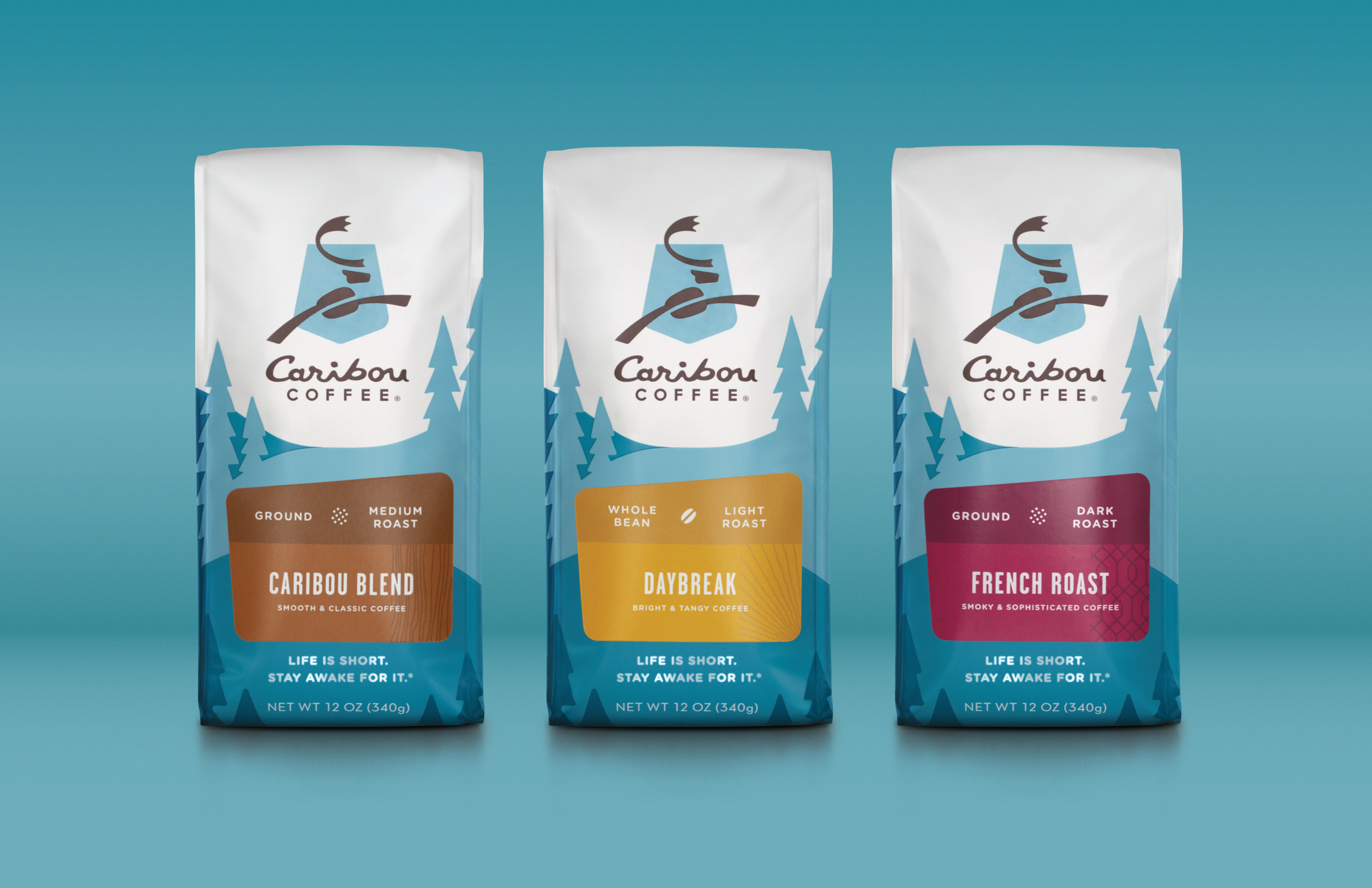
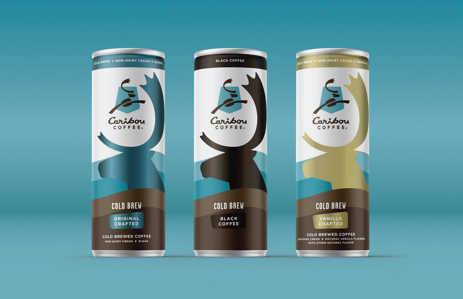
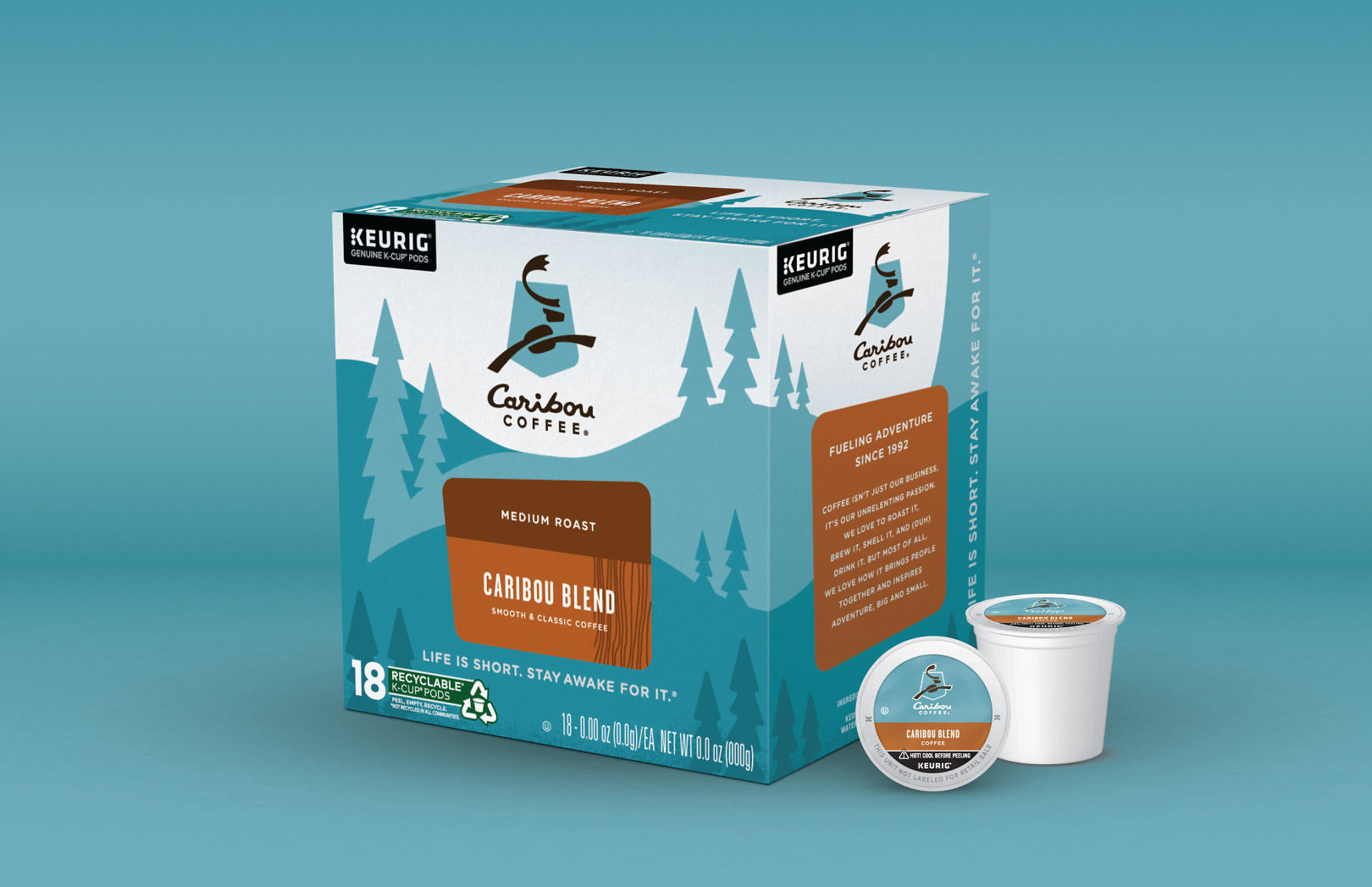
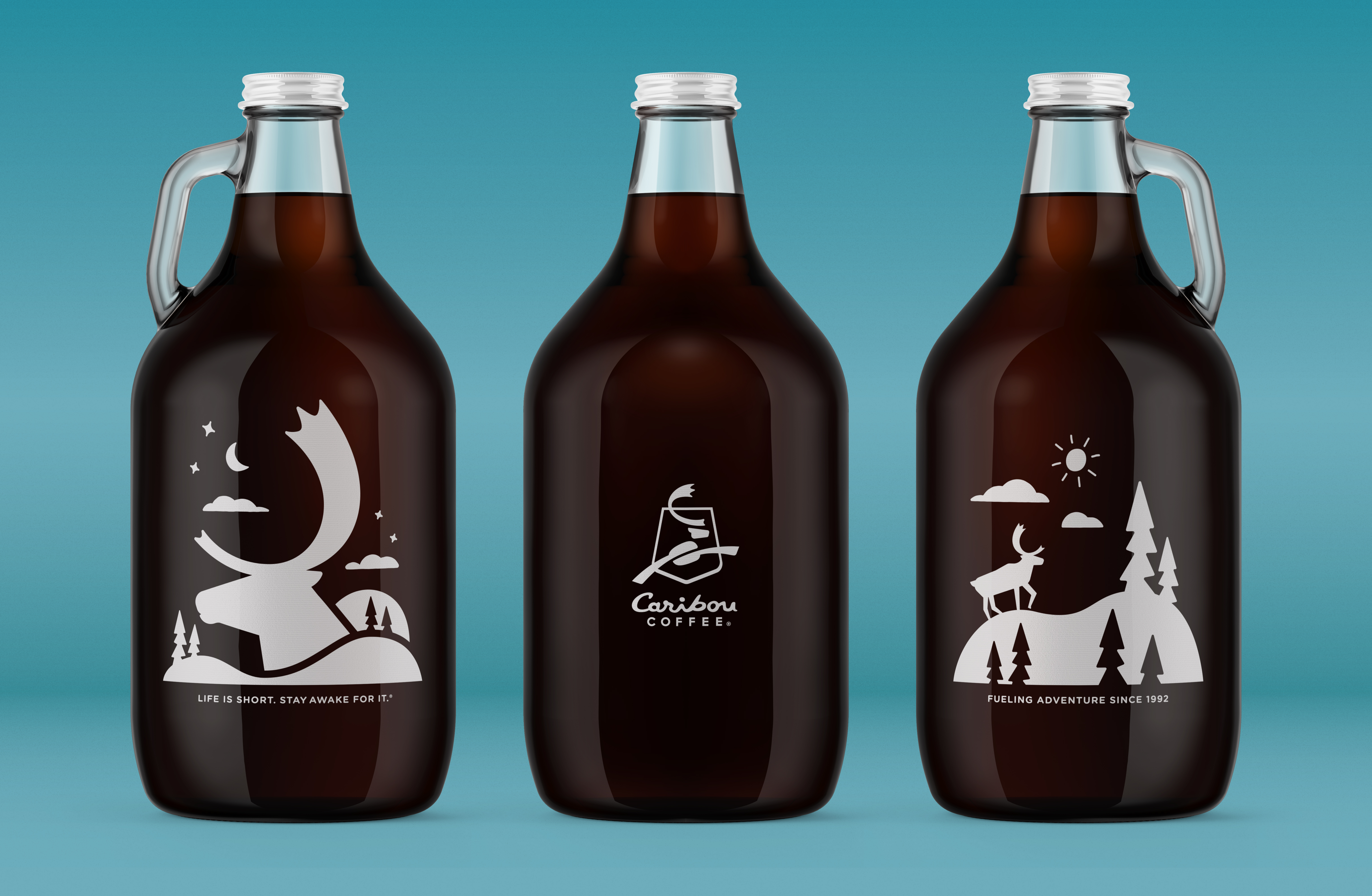
Caribou Coffee has been “Fueling Adventure Since 1992”, celebrating the North Woods as the favorite coffee of the upper Midwest. Drawing from that inspiration, we created a look and feel leaning on Caribou’s distinctive blue color. We added iconography supporting the brand and products, including traditional coffee, crafted drinks, innovative RTDs and more. Different audiences, different occasions, different points of sale, but one Caribou brand.
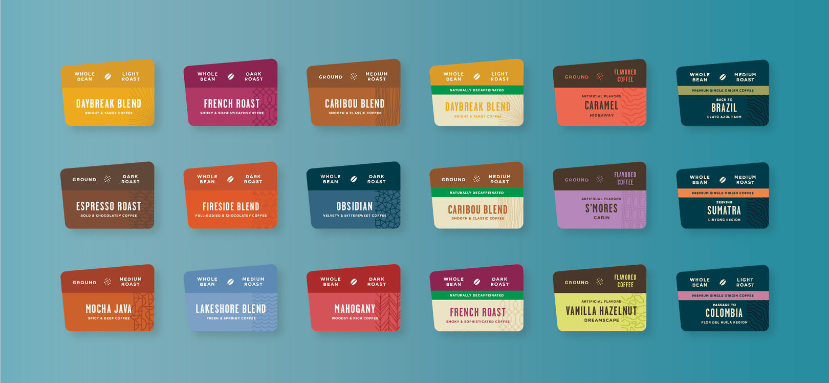
Signature packaging supported coffee credentials and made information like brewing instructions easy. Language engaged brand lovers with a playful personality. Label architecture brought signature, flavored, and single origin coffees into one system, differentiating each with color and pattern. Designations for ground, whole bean, decaffeinated and caffeinated products made navigating options easier.


Designed to support brand innovation, the system created continuity across multiple channels and points of sale. A unique expression for premium coffee with an approachable, playful personality.
