Zebco
- Brand Identity
- Iconography
- Packaging
- Portfolio Architecture
Reinventing an iconic outdoor brand

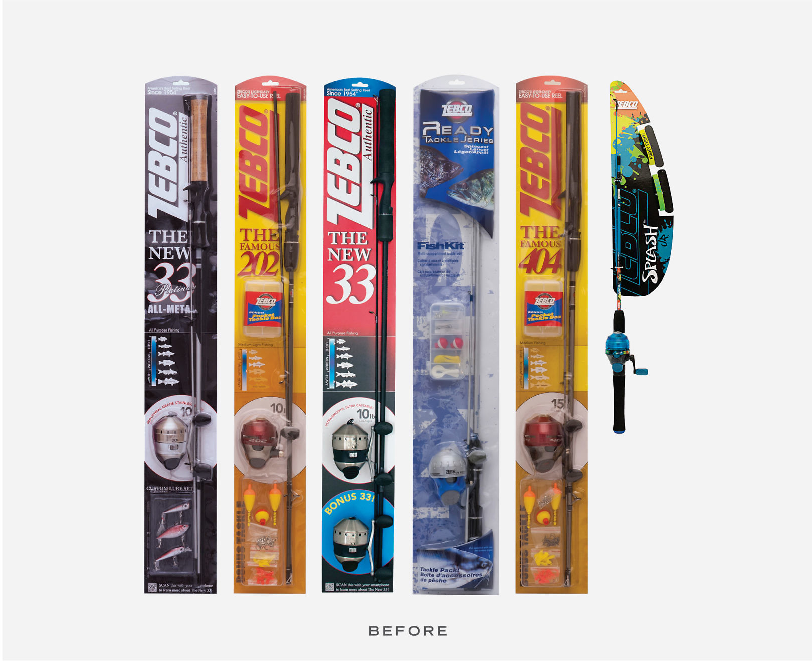
Zebco made fishing easier when it introduced a better spincast fishing reel in 1949. Back then, fishing was a way to relax, but today, fishing’s popularity has been challenged by expanding interest in a variety of other outdoor activities. To elevate its appeal, Zebco not only needed to reposition itself within a considered set of outdoor brands, but also become visible at retail.
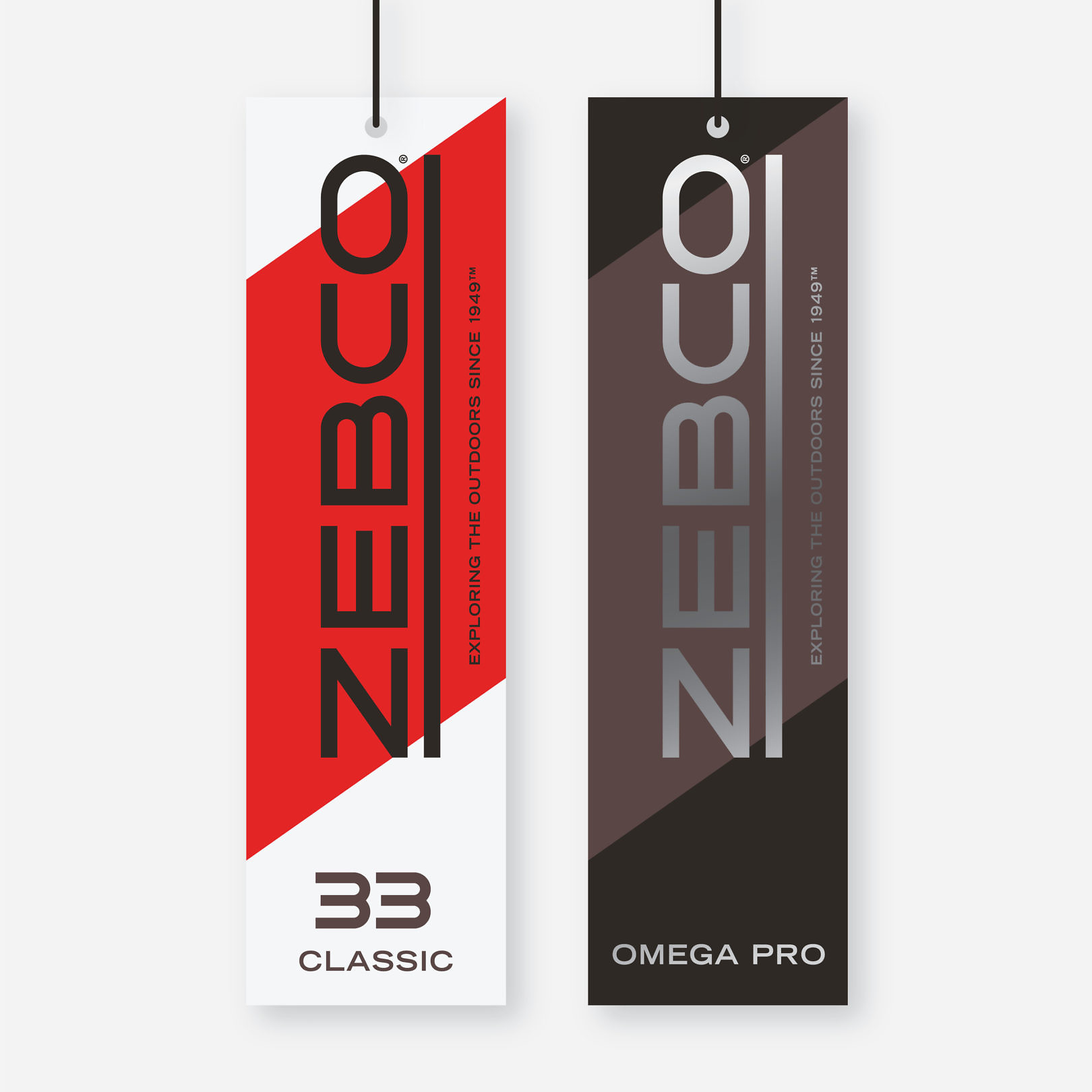
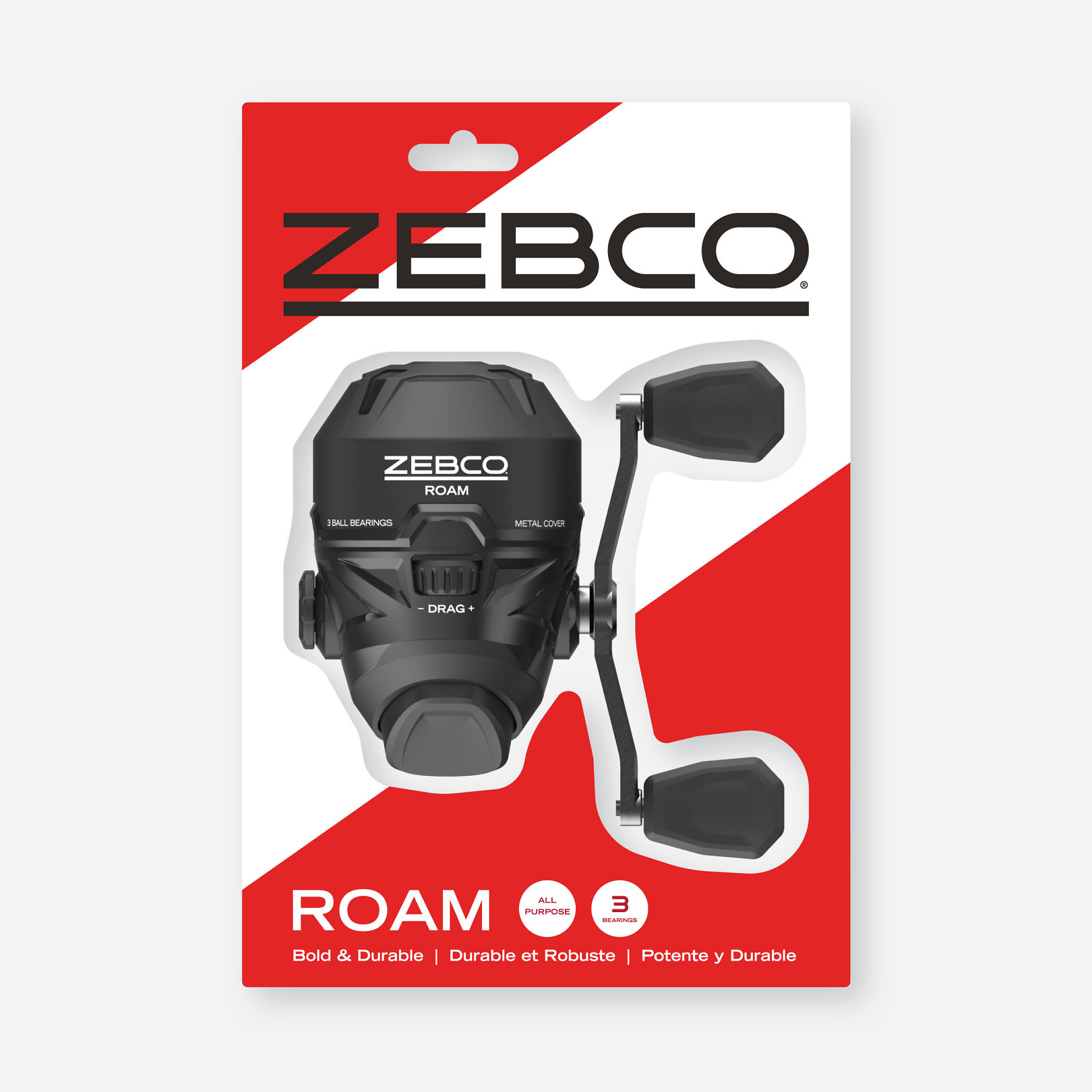
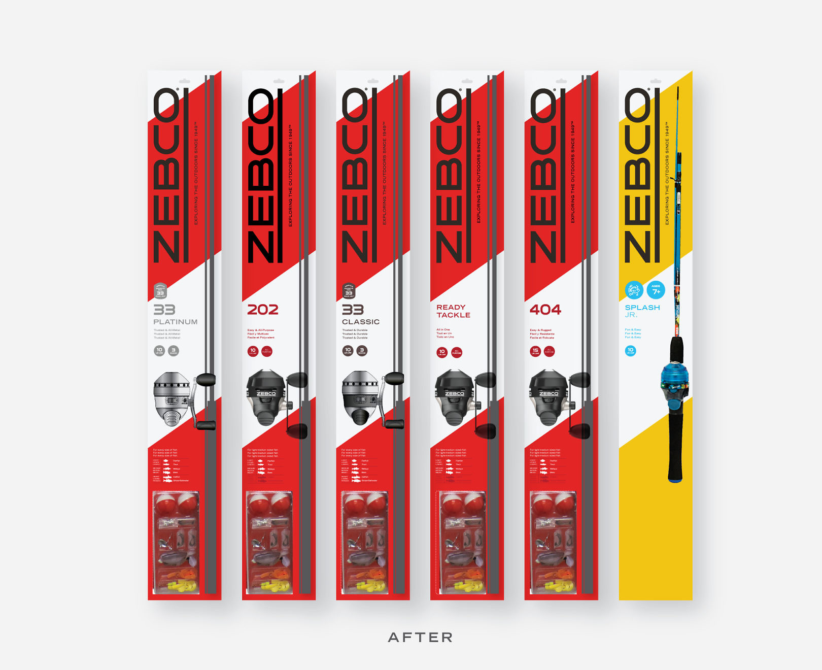
A bold new wordmark reset the look for the new brand. The extended system added a bold diagonal stripe to create visual disruption at retail. The portfolio consisted of a wide range of products, including value, flagship, and premium tiers. Simple typography and iconography established a clear hierarchy of names and features, making products easier to shop. Packaging forms included hang tags for open stock, boarded rod-and-reel combos, and clam packs and boxes for reels.


