Phillips
- Brand Identity
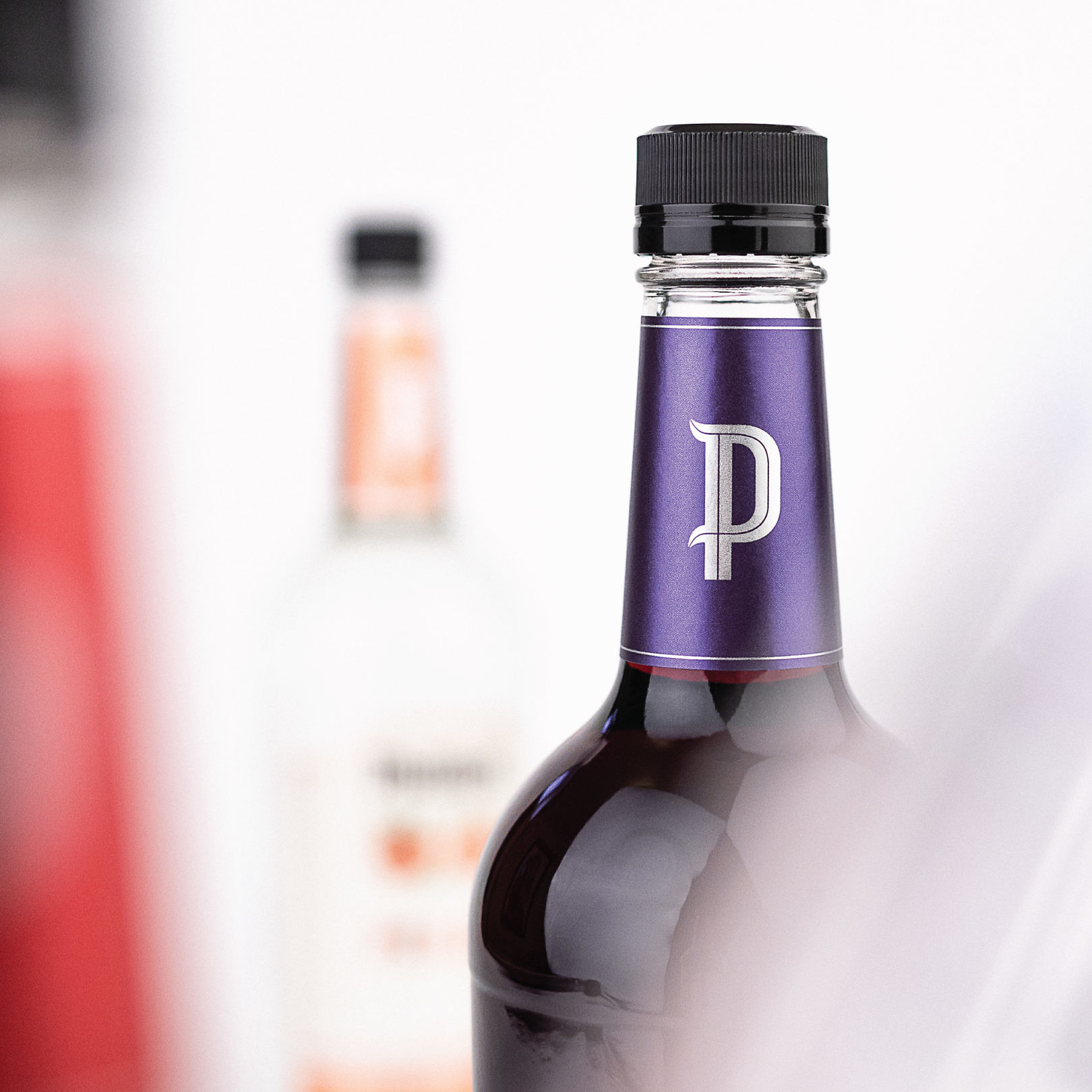
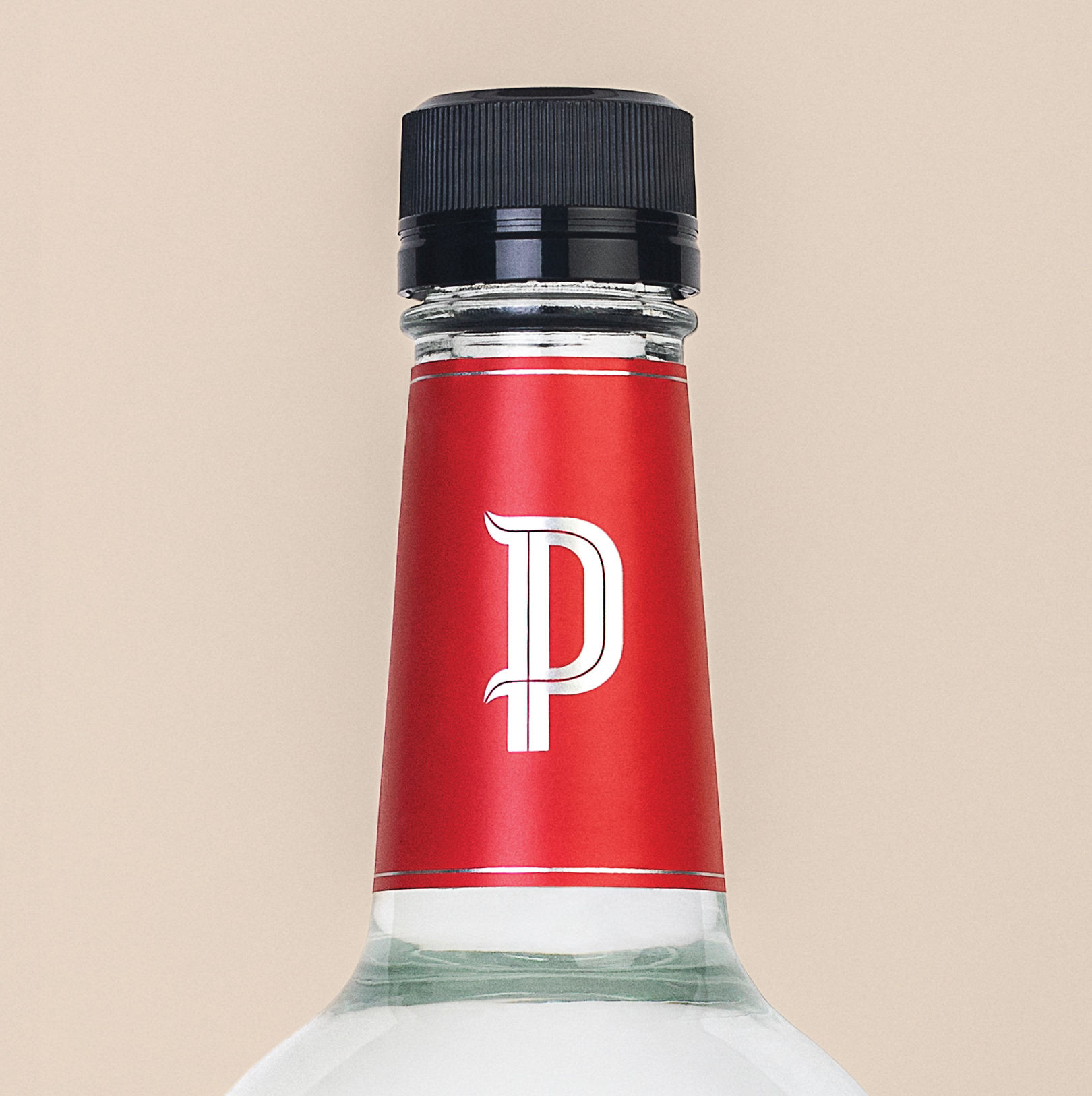
- Iconography
- Packaging
- Portfolio Architecture
Spanning tradition and modernity
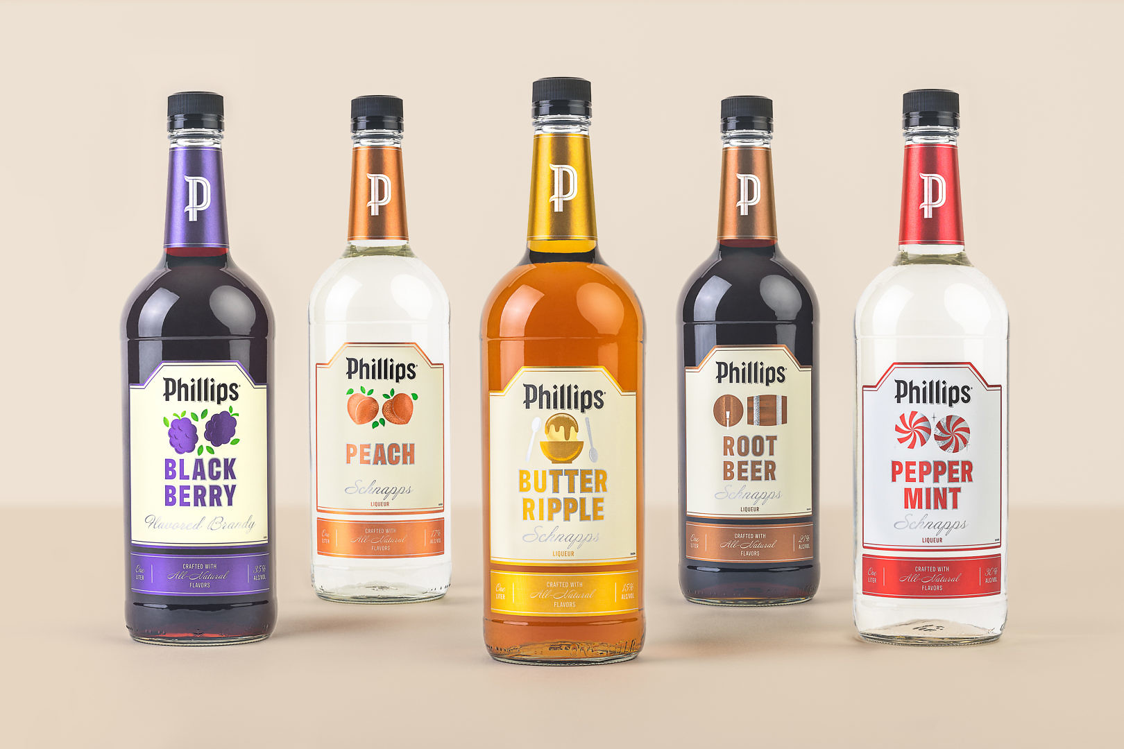
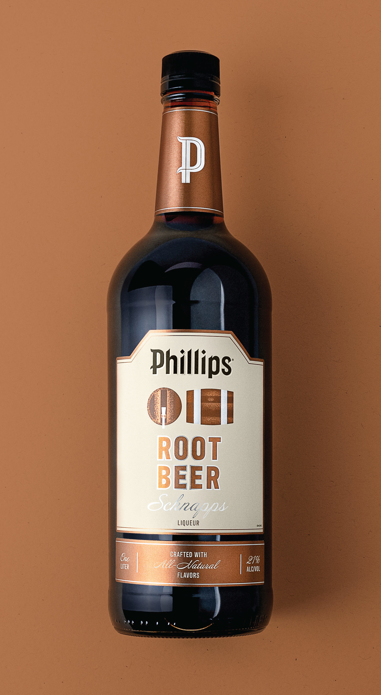
With a rich history spanning more than 100 years, five generations, and hundreds of SKUS, the Phillips flagship brand presides over a broad range of innovative spirits. This redesign gave the brand portfolio a fresh look while retaining the likeability the brand enjoys as a “Midwest favorite.”
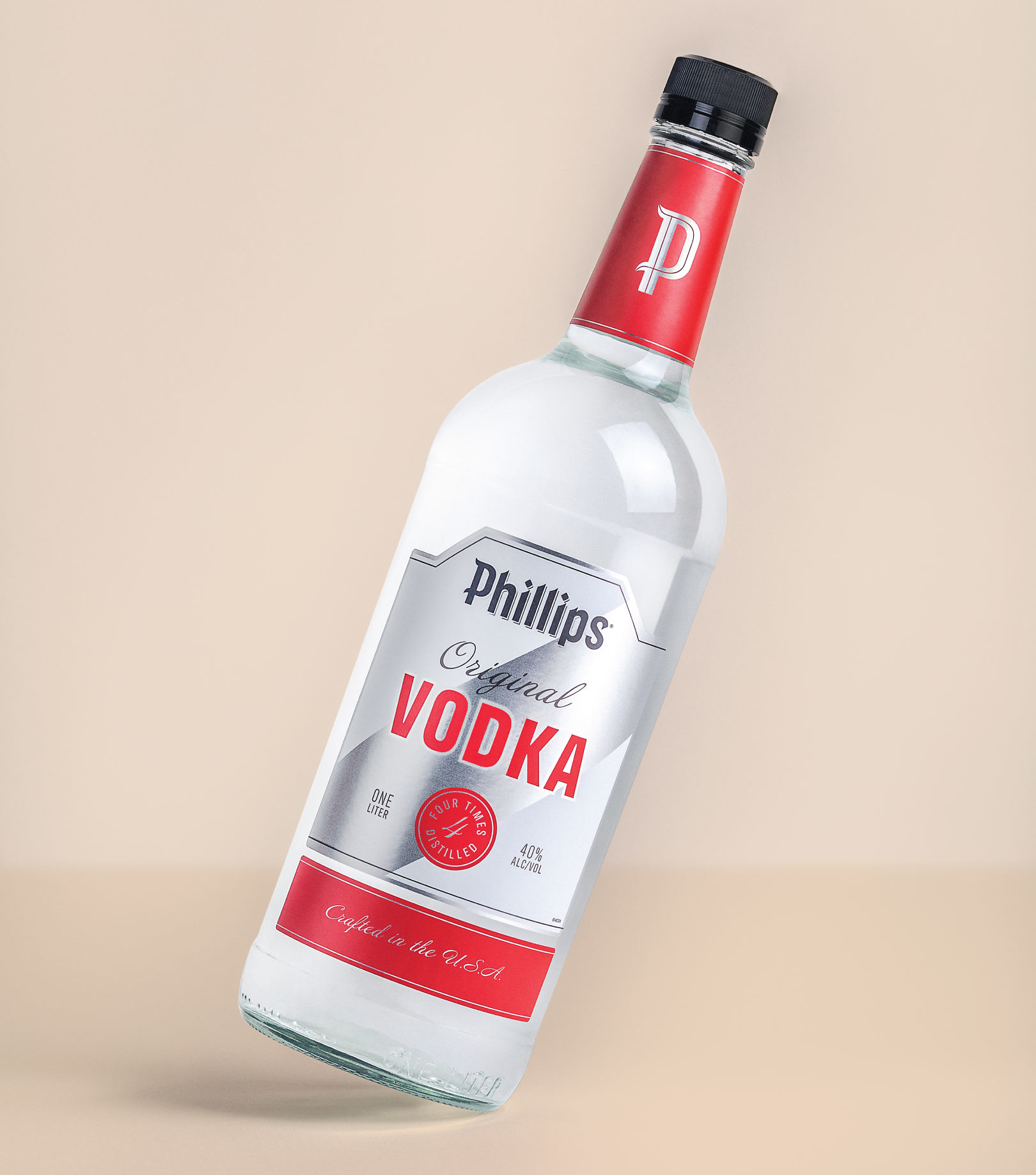
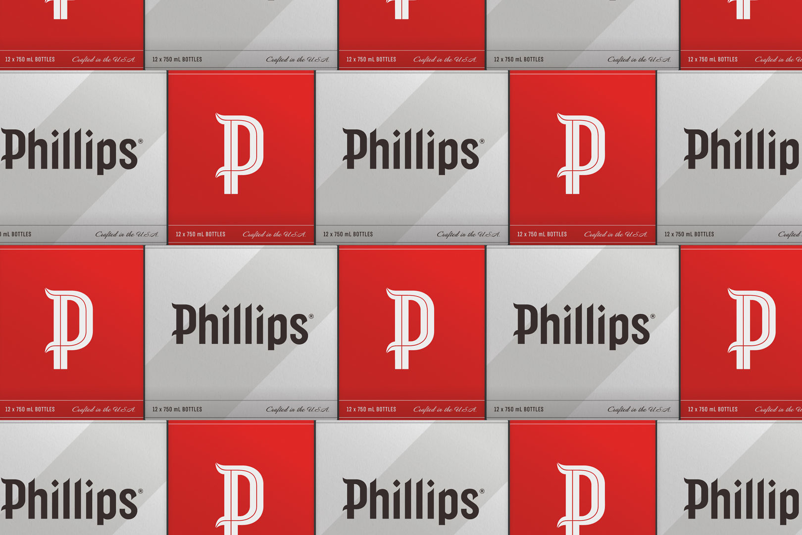
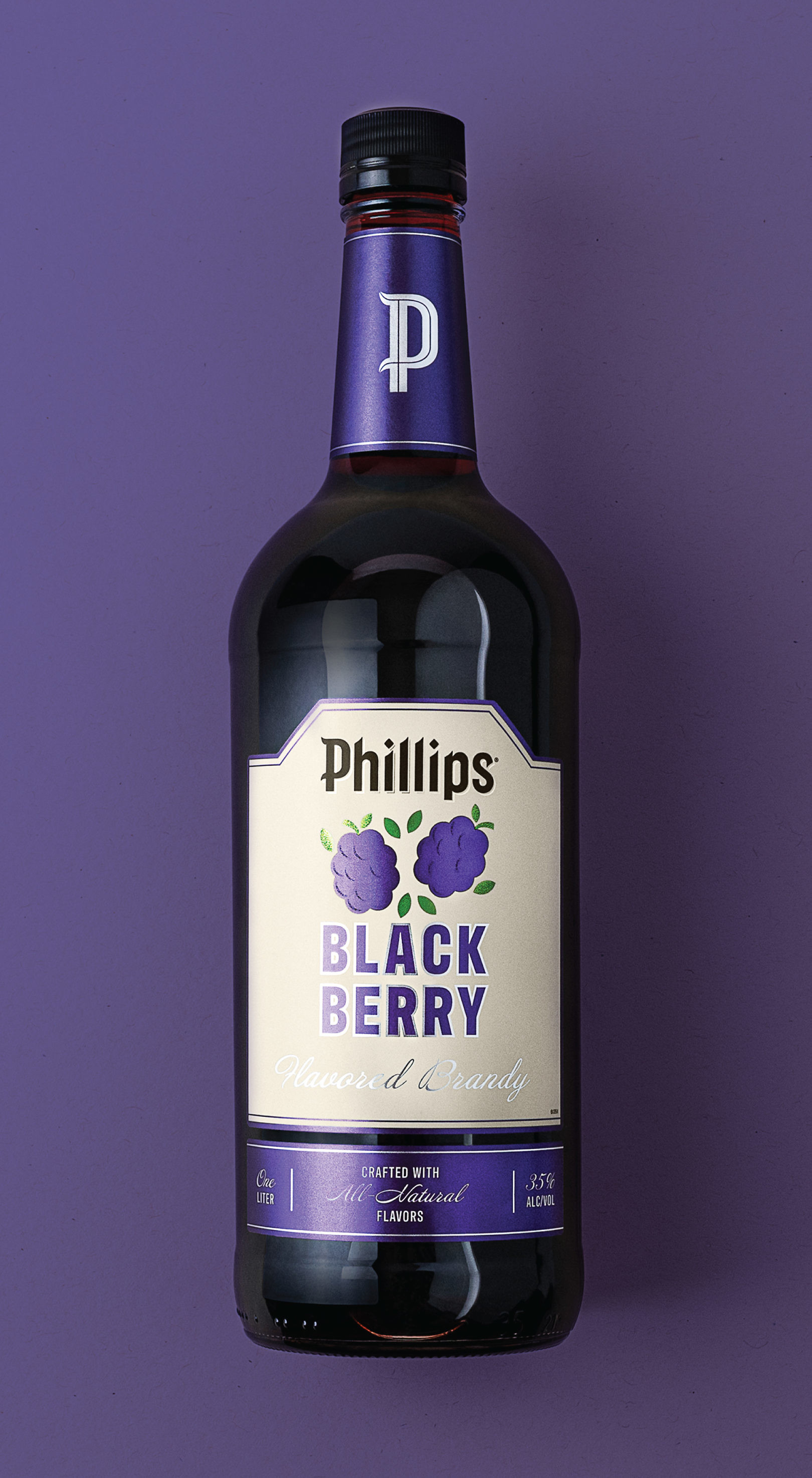
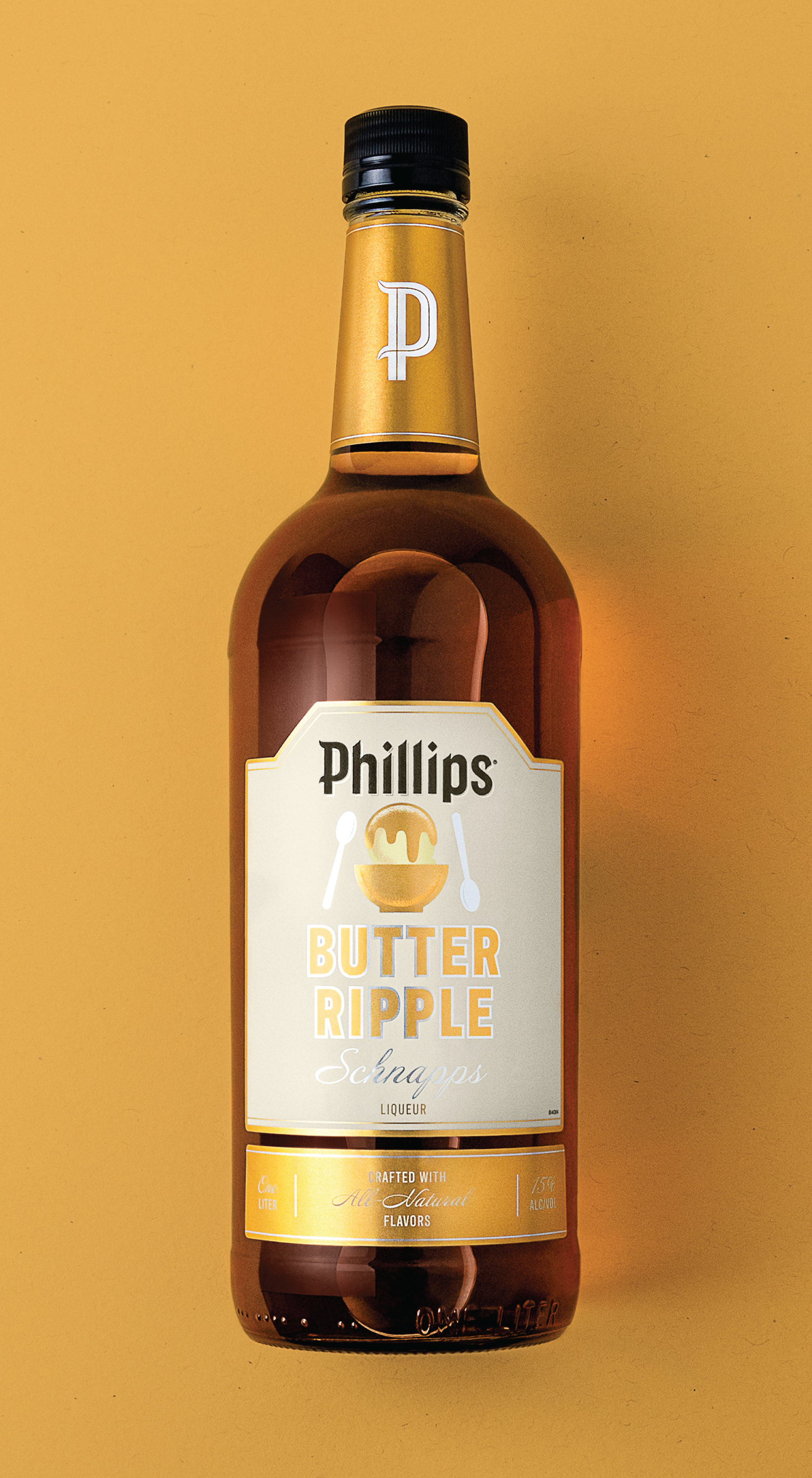
The new expression was designed for flexibility, with a clear hierarchy that makes the expansion of innovative products easy to take to market. Original core spirits use an updated classic look. Flavored spirits incorporate illustrations to differentiate flavors. Together, they elevate the brand expression, making products easy to navigate on shelf. From classic standards, to flavored liqueurs and ready-to-serve cocktails, the brand has a revitalized presence on retail shelves.