Revel Stoke Whisky
- Brand Identity
- Naming
- Packaging
- Portfolio Architecture
Stoking disruption in the whisky category
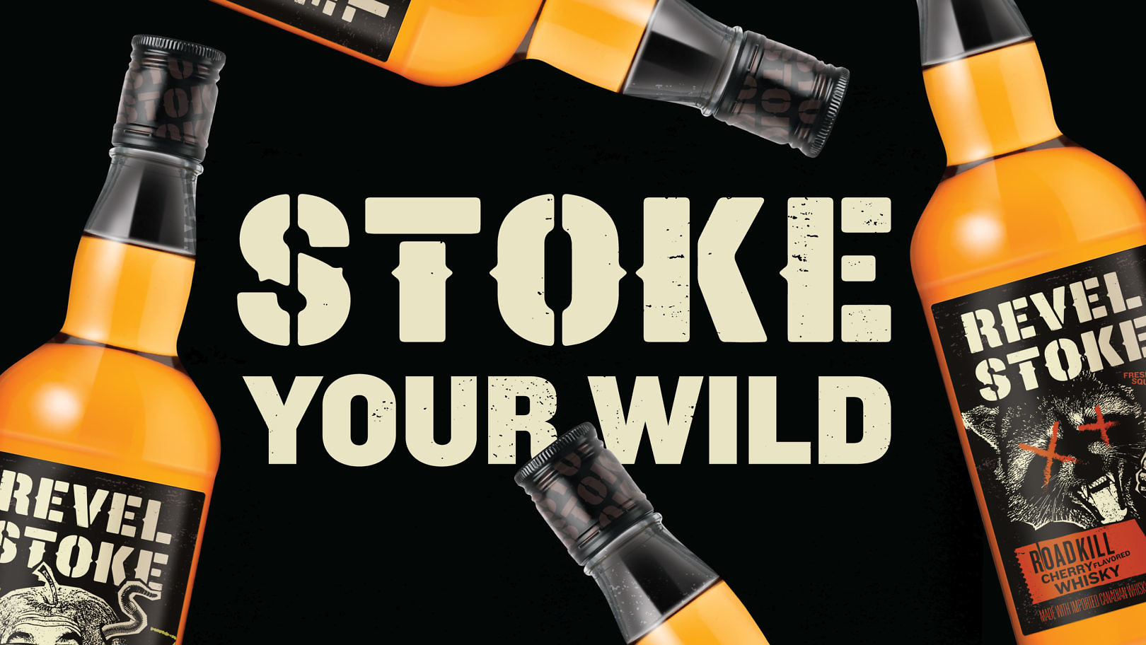
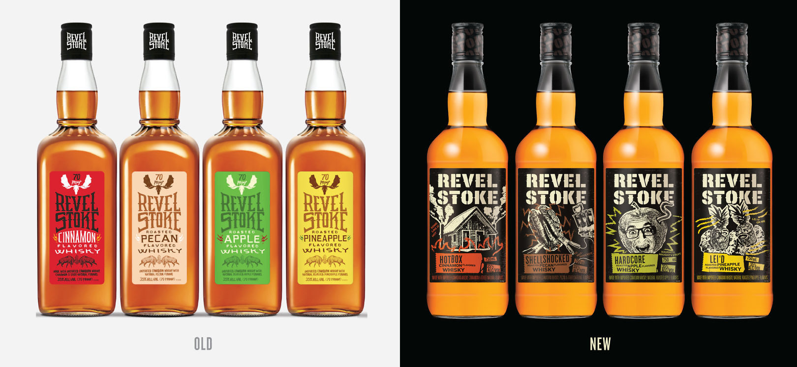
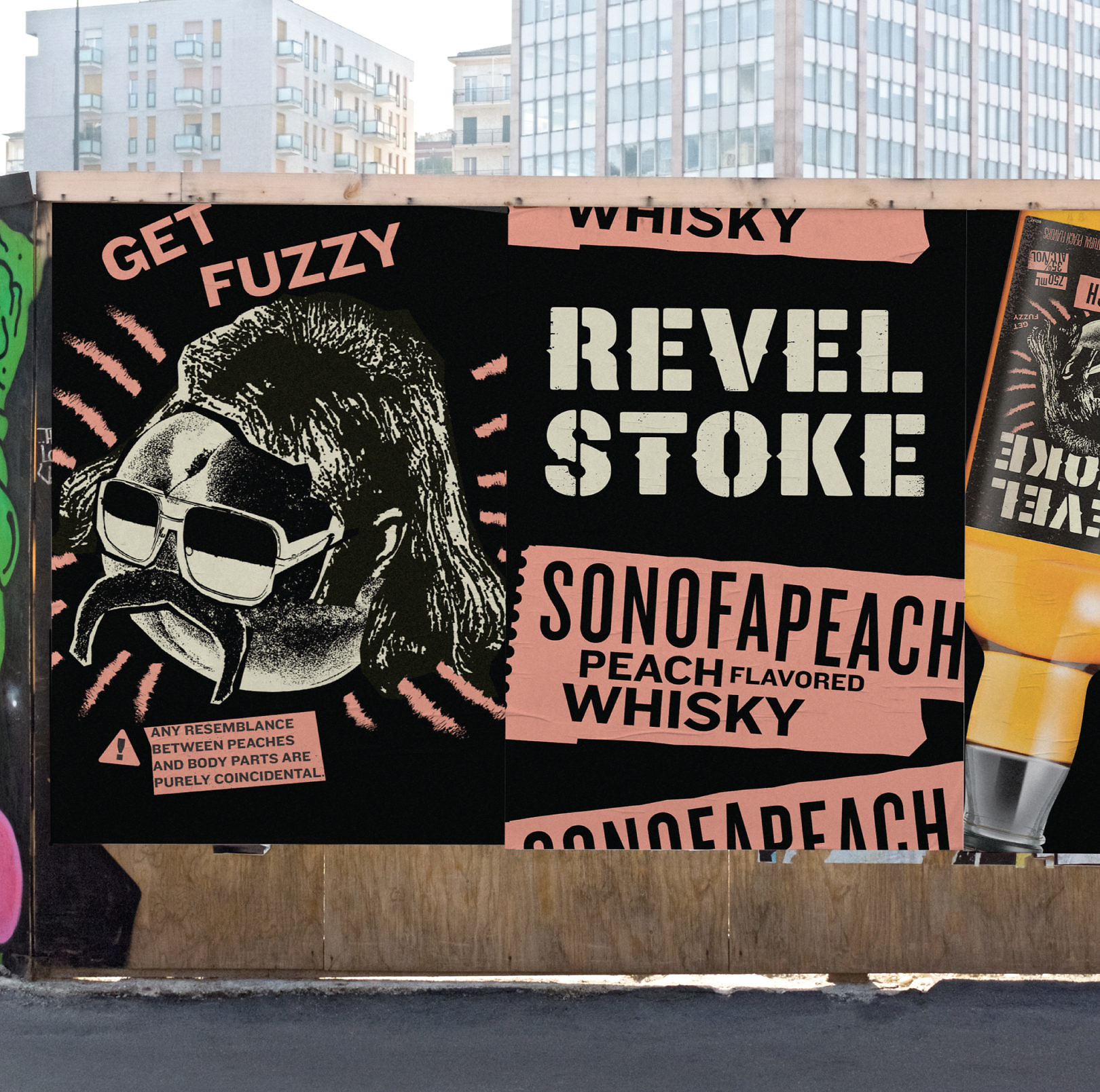
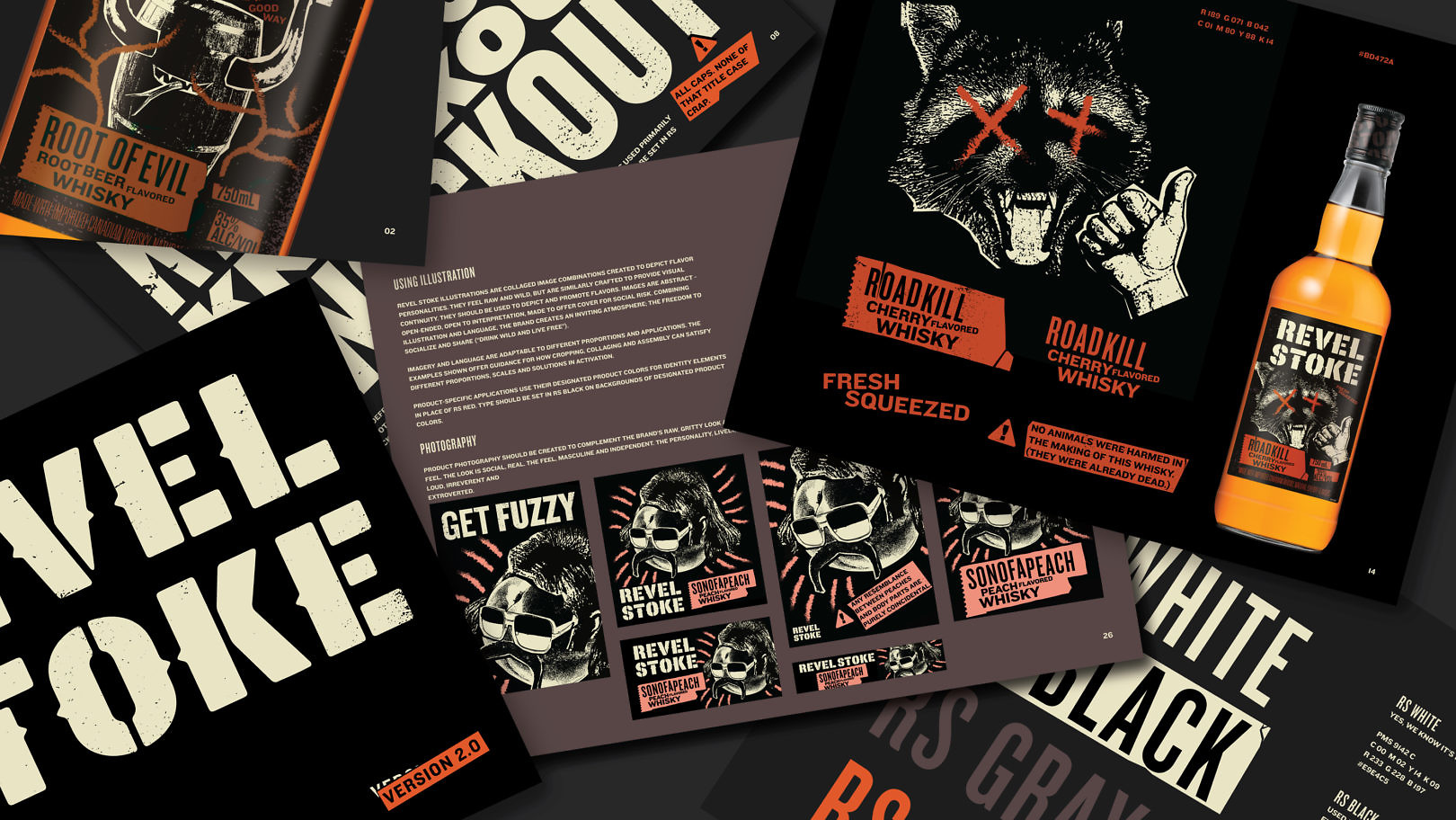
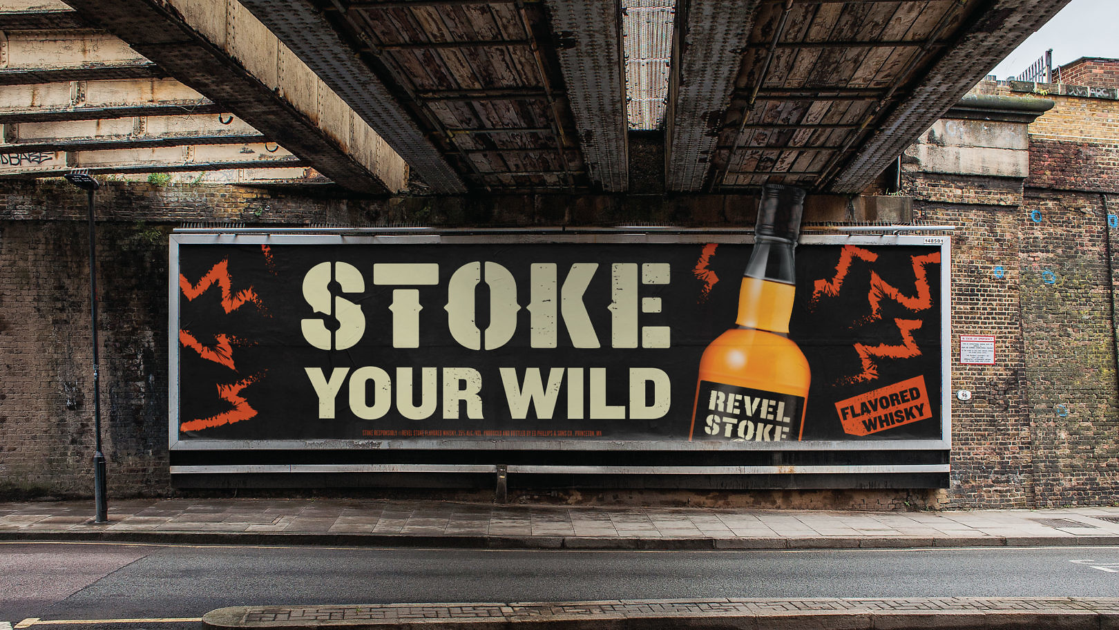
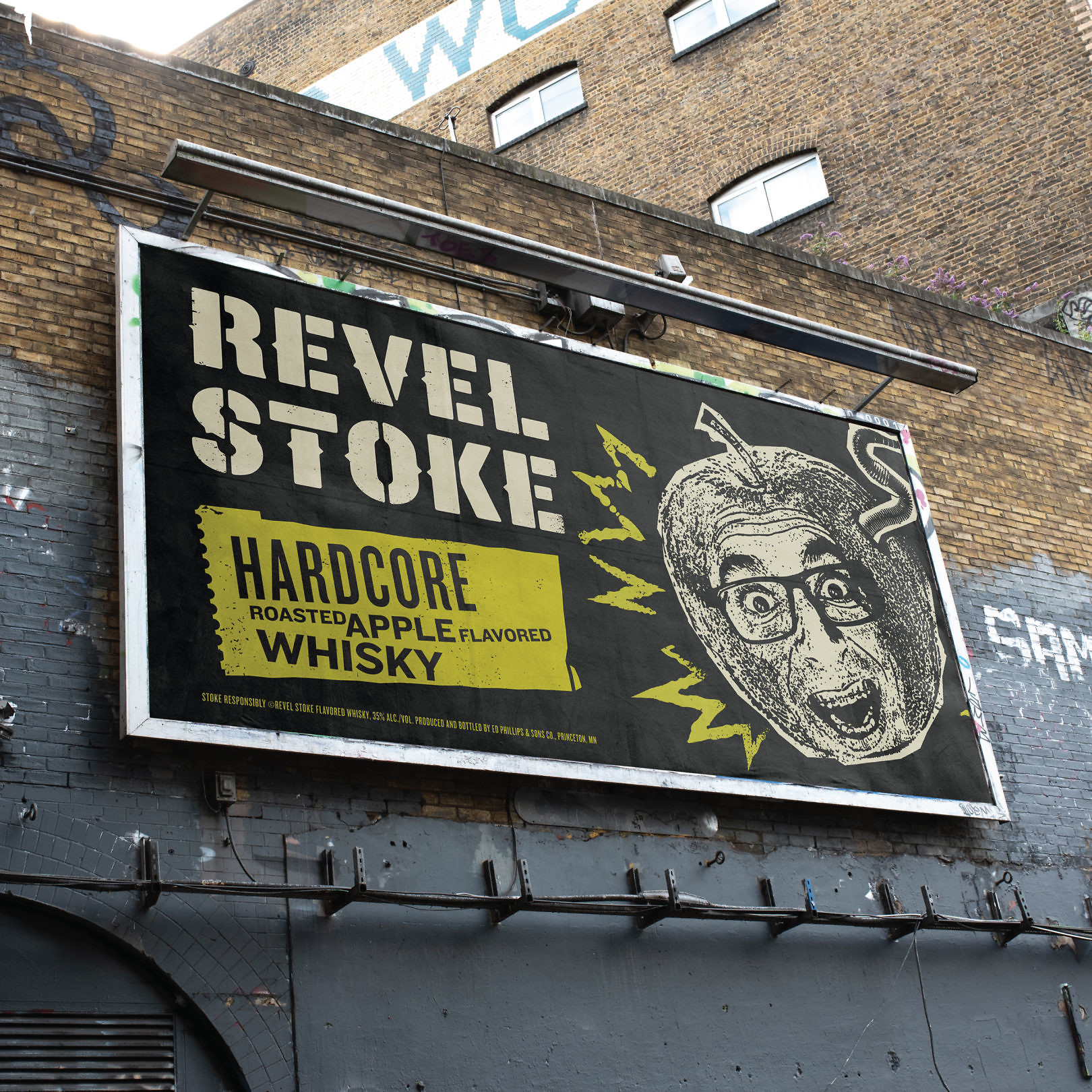
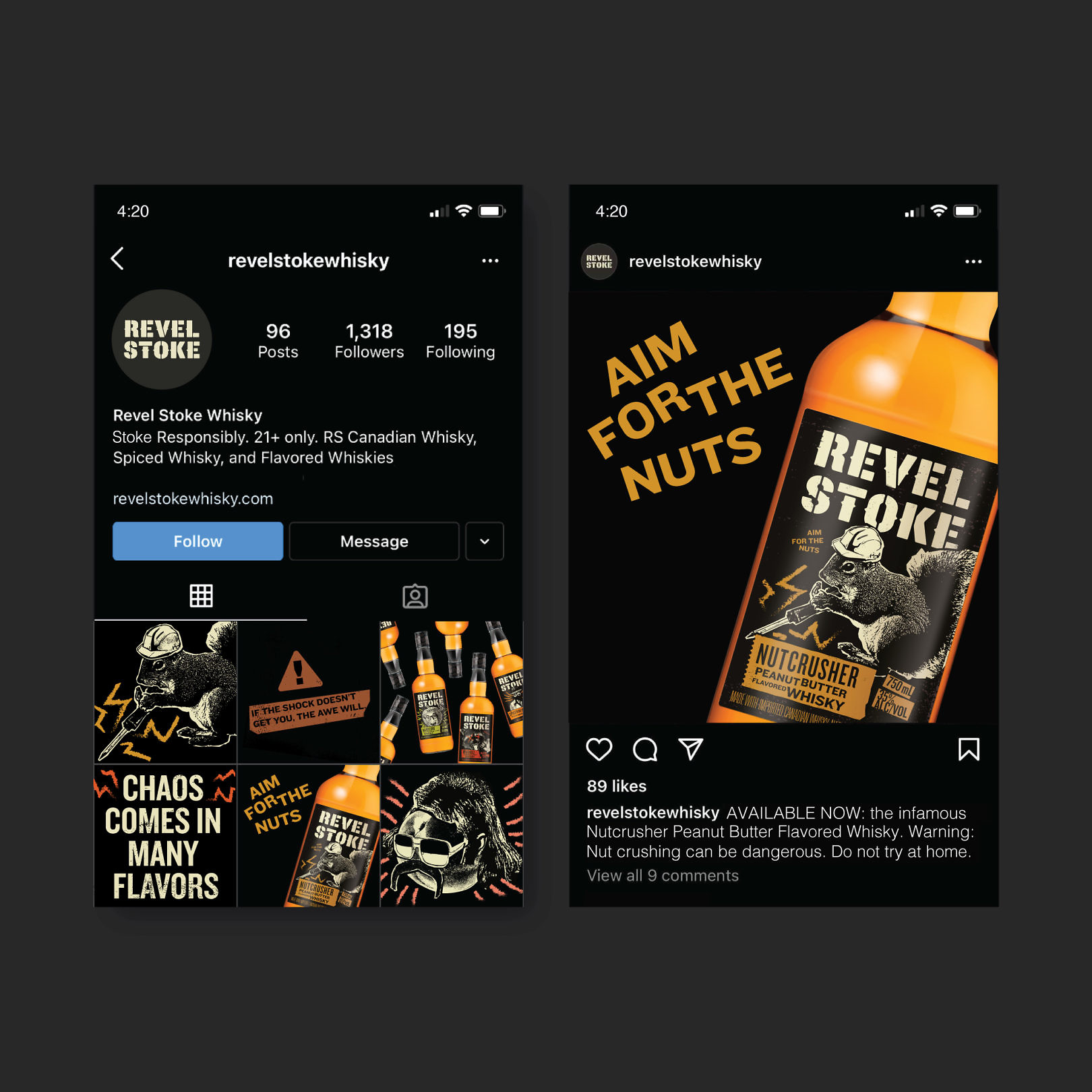
Revel Stoke was created as an alternative to the connoisseurship and snobbery of traditional whisky. Its spiced and flavored whiskies had experienced some success, but the brand was not delivering the energy needed to connect with consumers. We reinvented Revel Stoke, shifting focus from flavor to bold energy, inviting adventurous drinkers to explore social risk – a call to celebrate good times, live in the moment, run wild, and drink free.
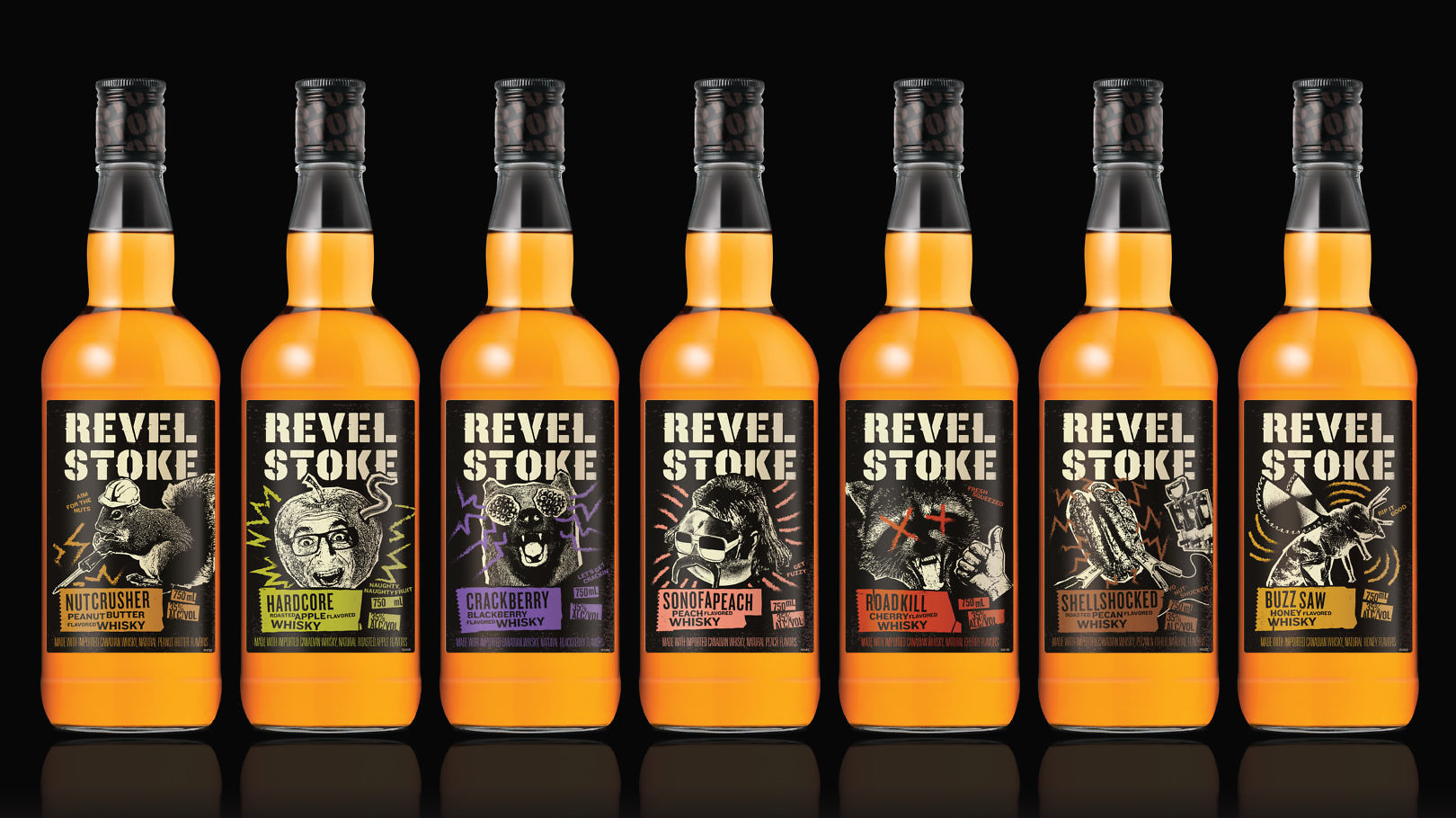
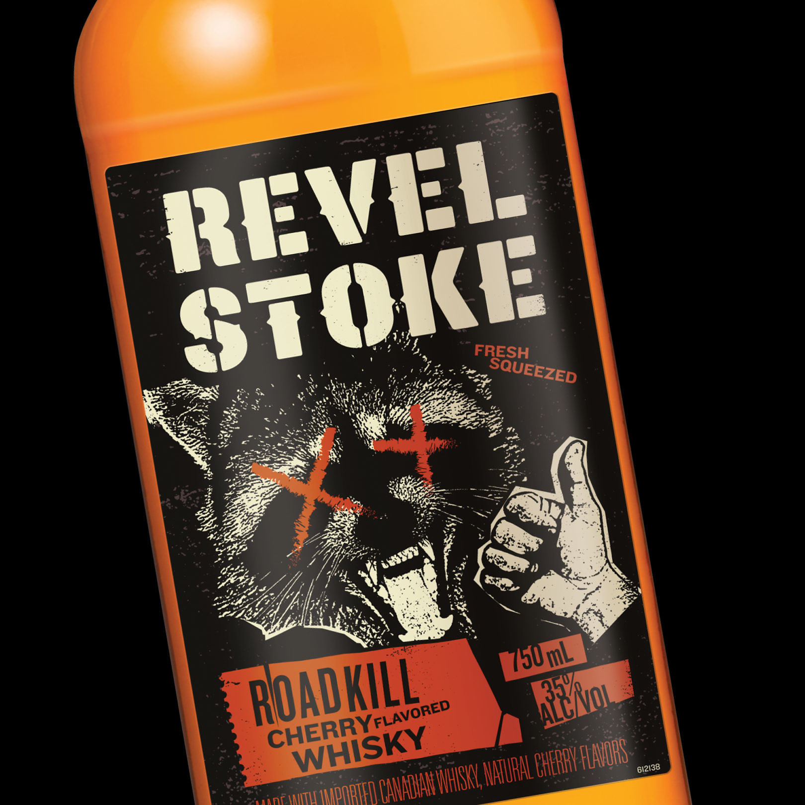
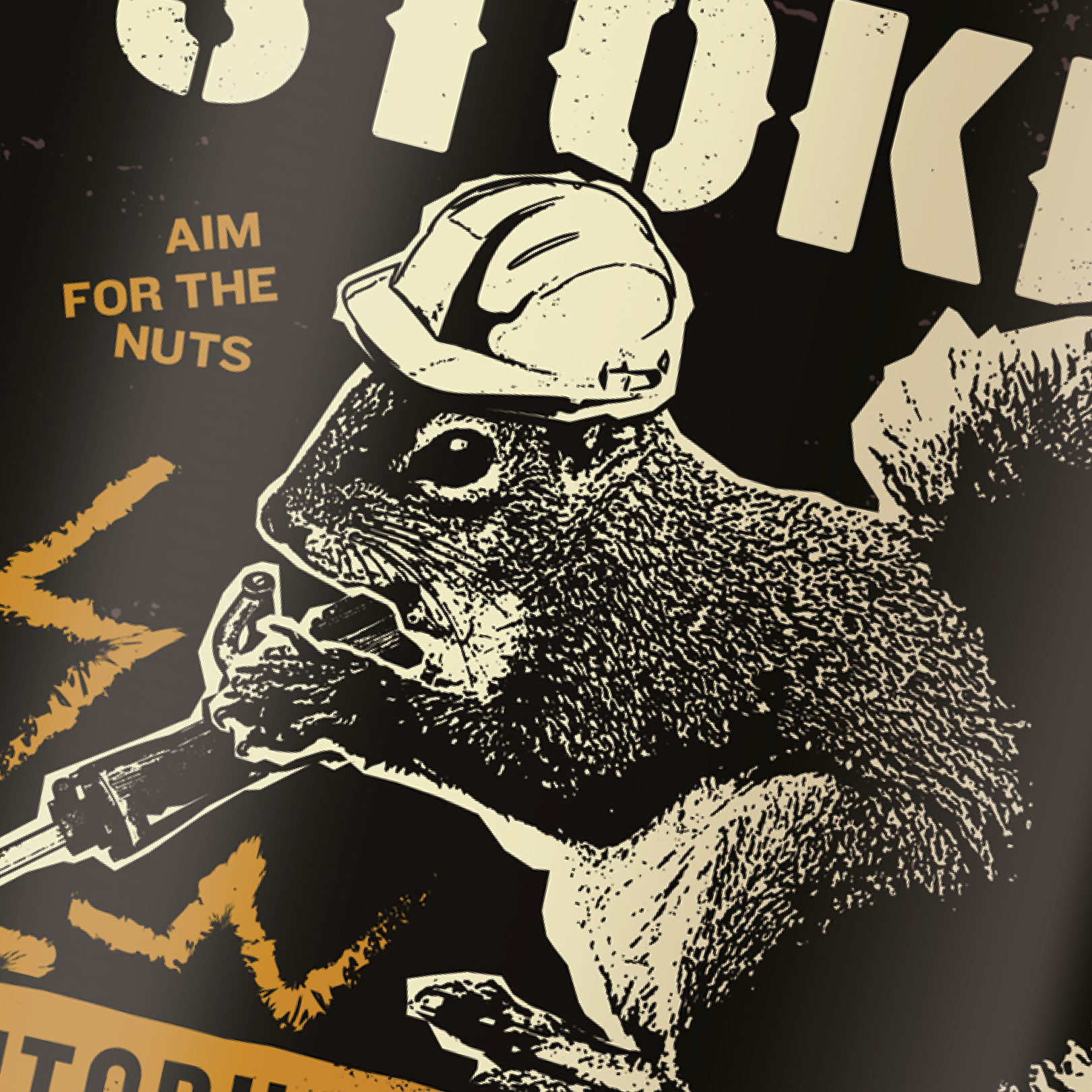
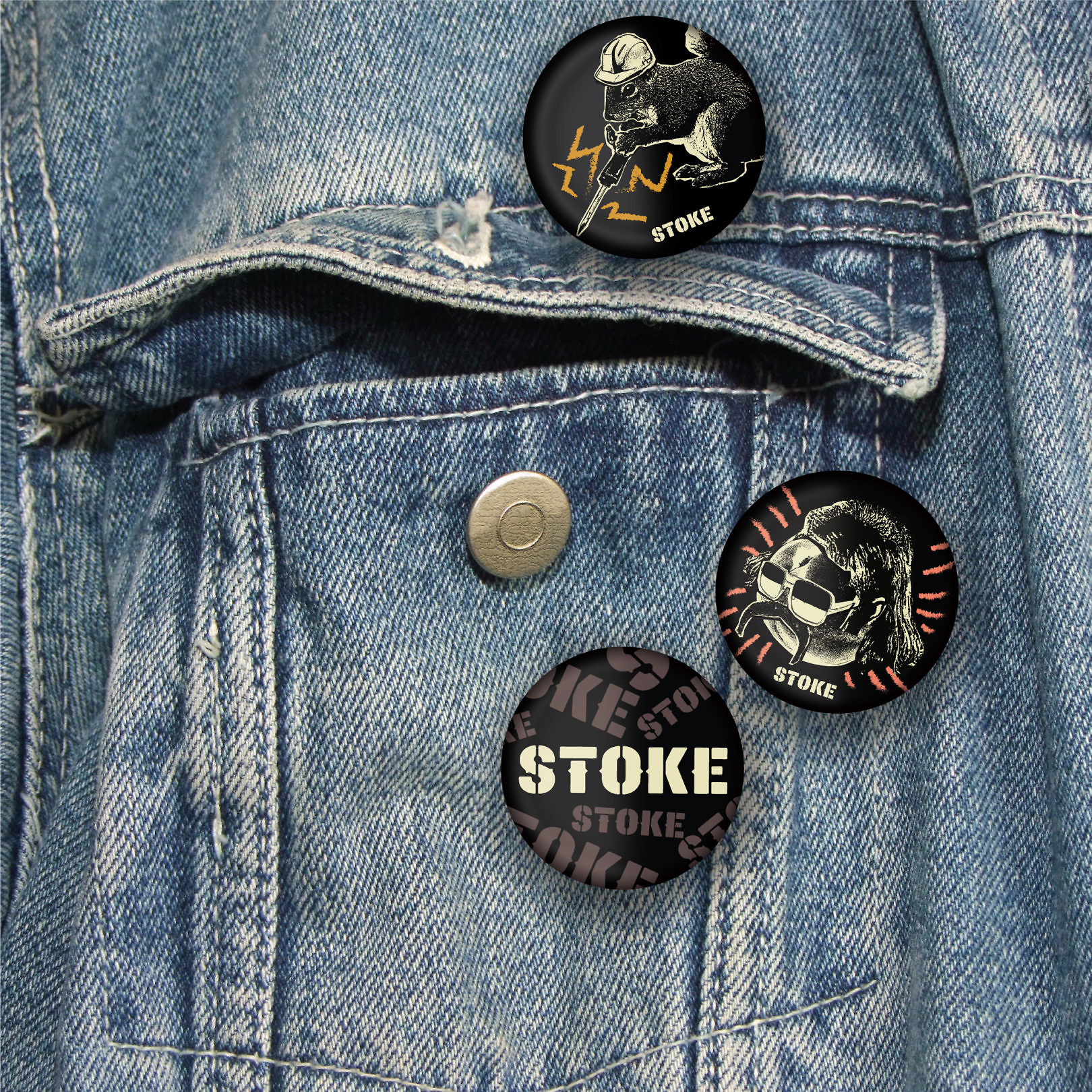
Contrasting conventional flavored whisky, we recast Revel Stoke as brash and extroverted, creating personalities to define each flavor. Outrageous names, absurd language, and punk-inspired illustrations give each flavor a distinct persona, designed to be noticed and socially shareable.
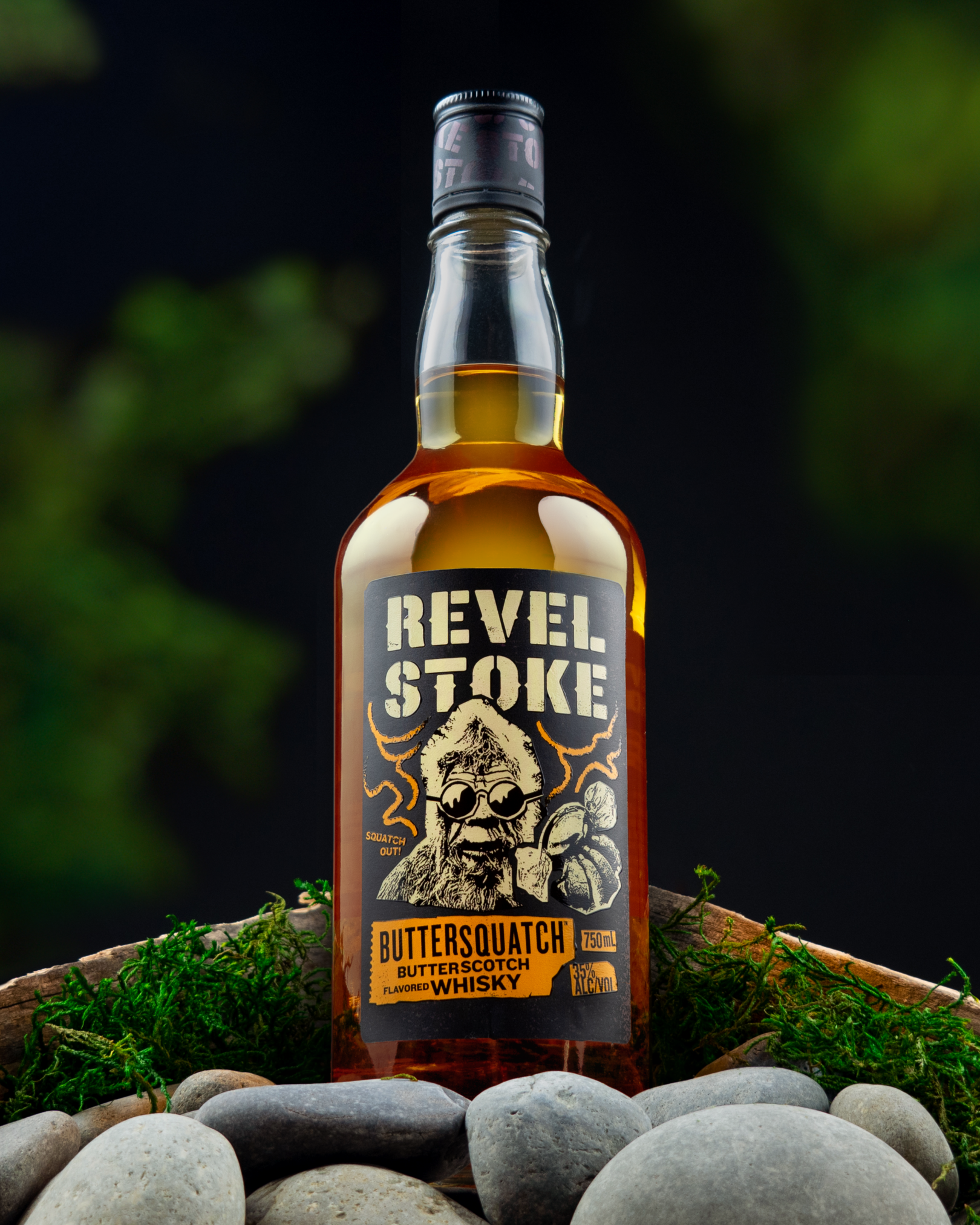
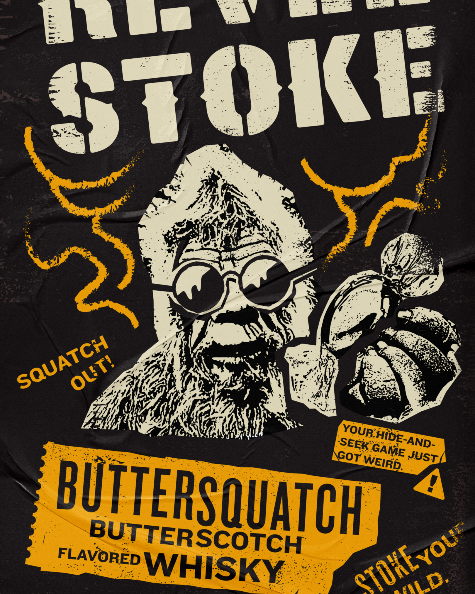
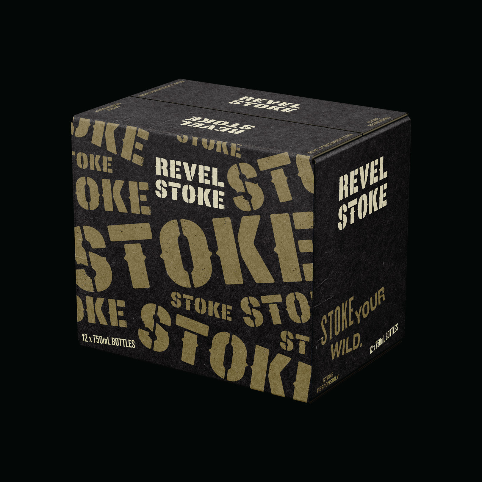
Naming, language, color and illustrations work together to empower brand activation. Elements created to express the brand are flexible, supported with a strong point of view that comes to life in merchandise, advertising, social media, and point of sale. The system’s logic makes adding new flavors easy to envision, and go-to-market ready.

Before & After