Leroux
- Brand Identity
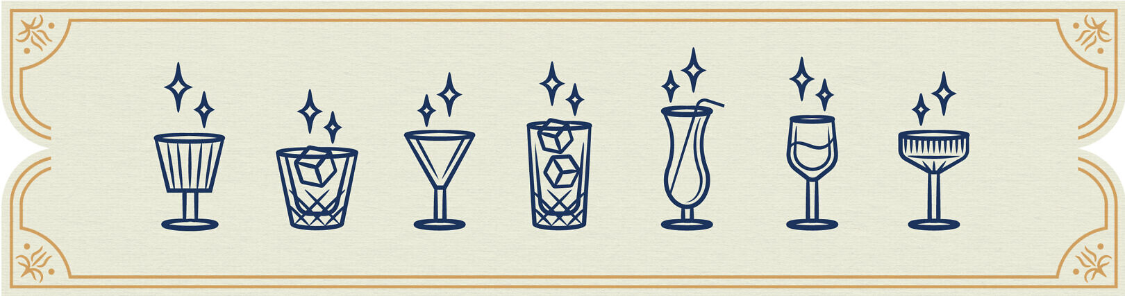
- Iconography
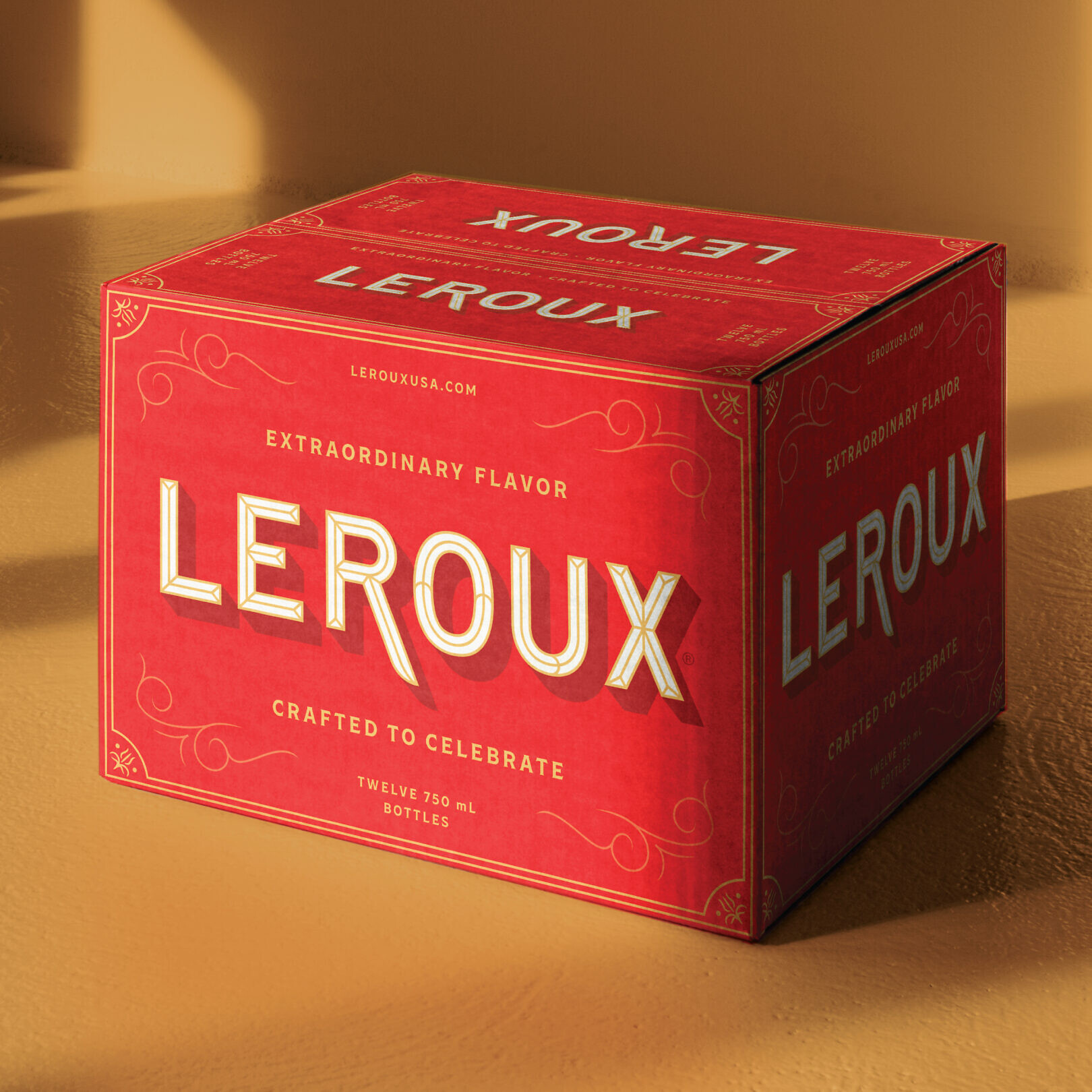
- Packaging
- Portfolio Architecture
Crafted to celebrate extraordinary flavor
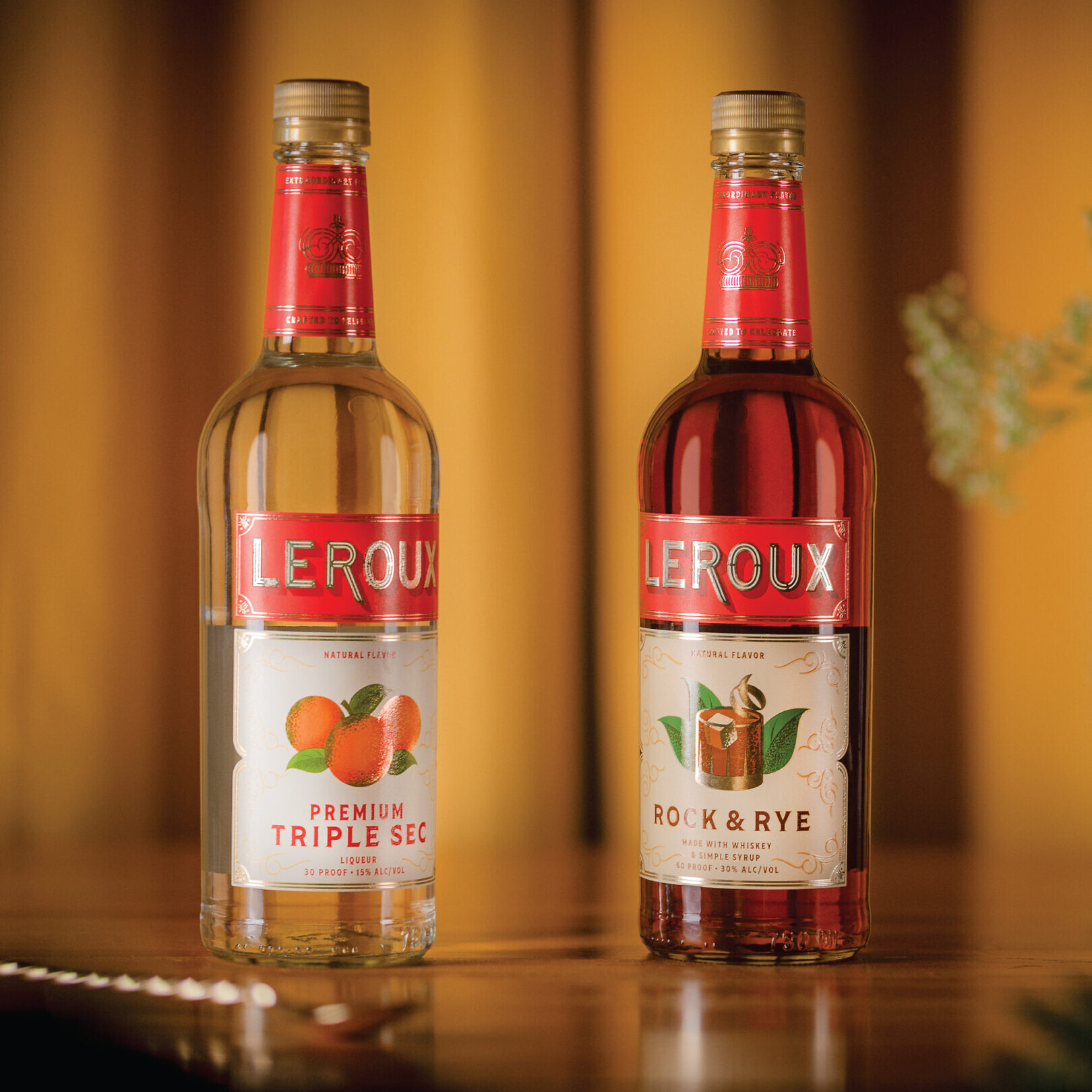
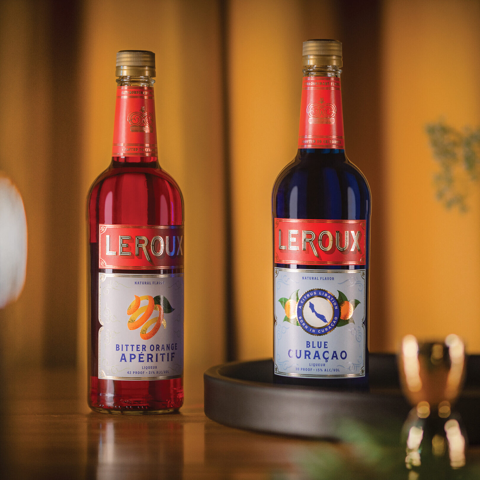
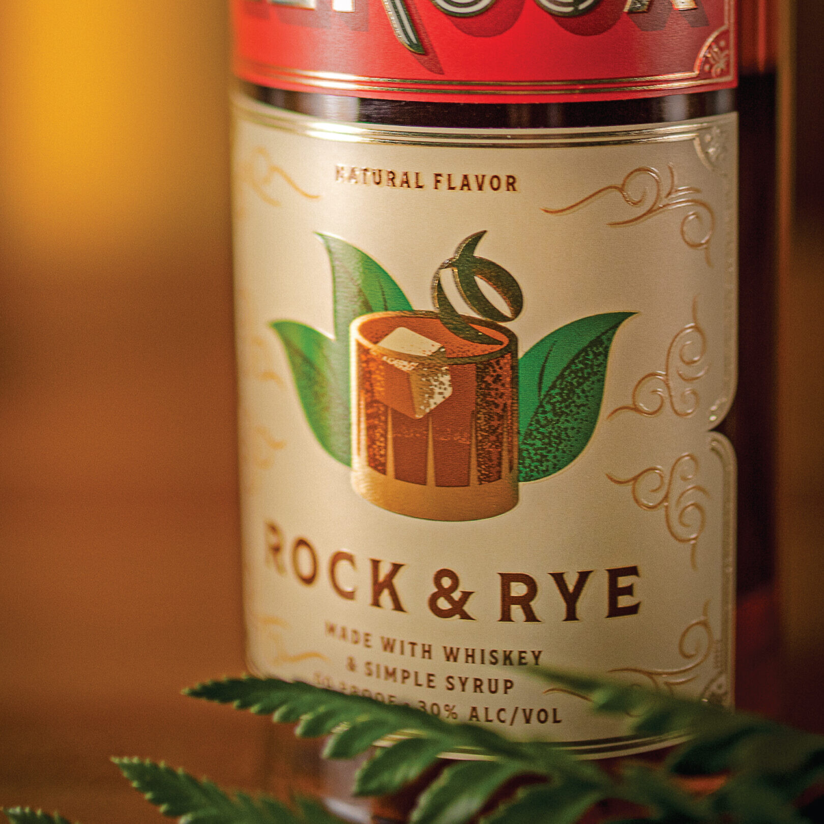
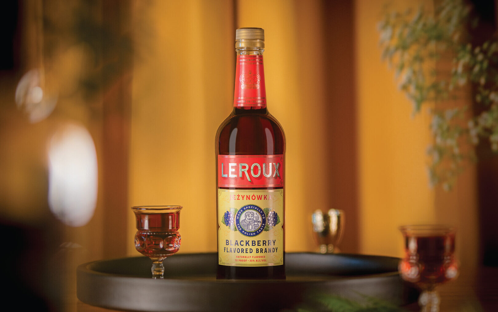
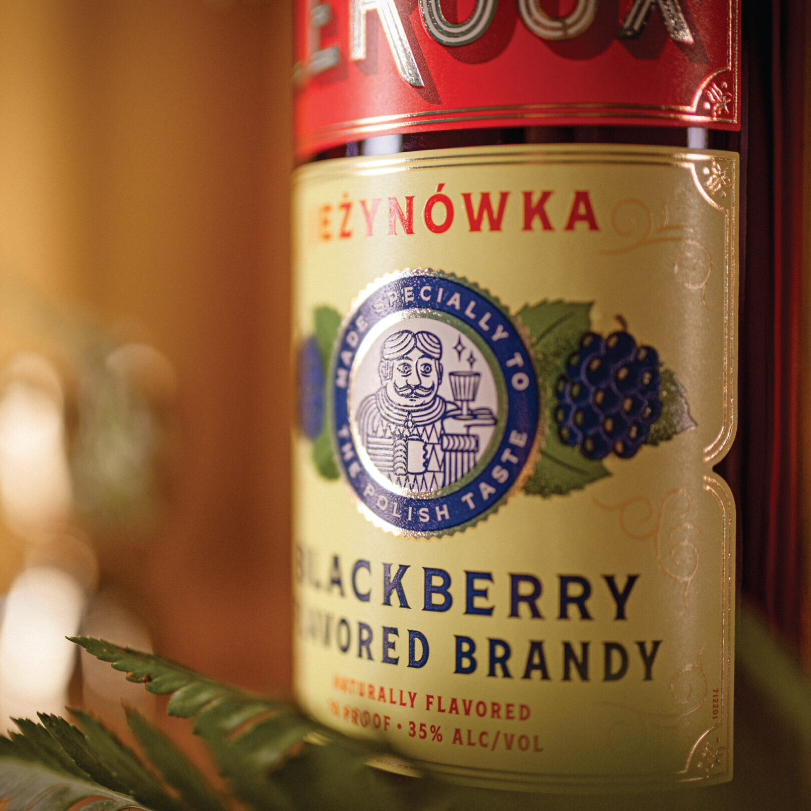
A storied brand with a century of history, Leroux is crafted to celebrate extraordinary flavor. Leroux offers a wide variety of products, making it a perfect accompaniment to every occasion. Sipped, shot or savored, it’s a great way to celebrate all that life offers. But, over the years, the brand lost its credibility and presence on shelf. To strengthen the brand’s reputation for innovative products, the new expression honors equity of the past, adding refined filigree and iconography. The packaging system illustrates flavor cues that elevate its repertoire of home bar options.
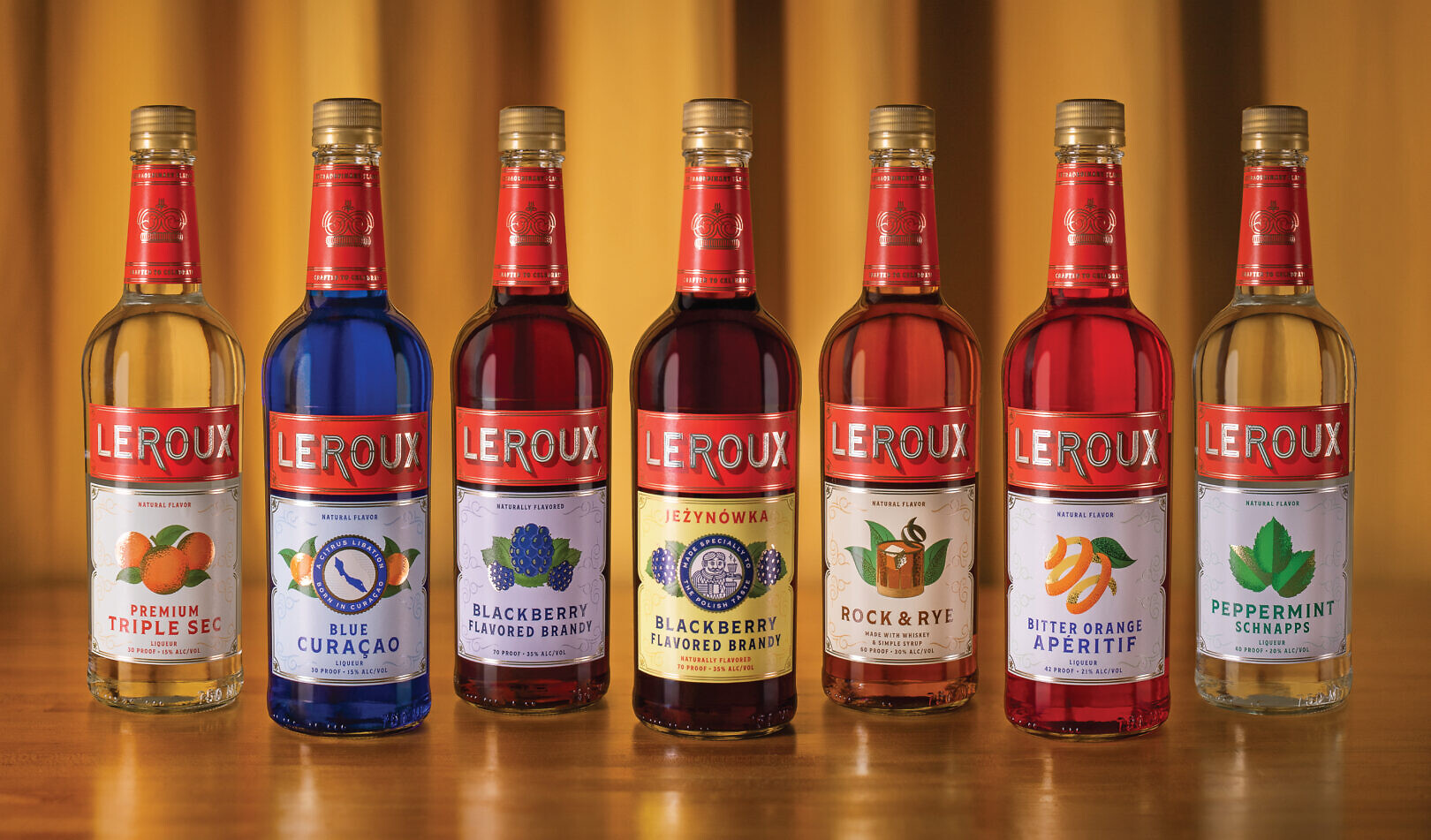

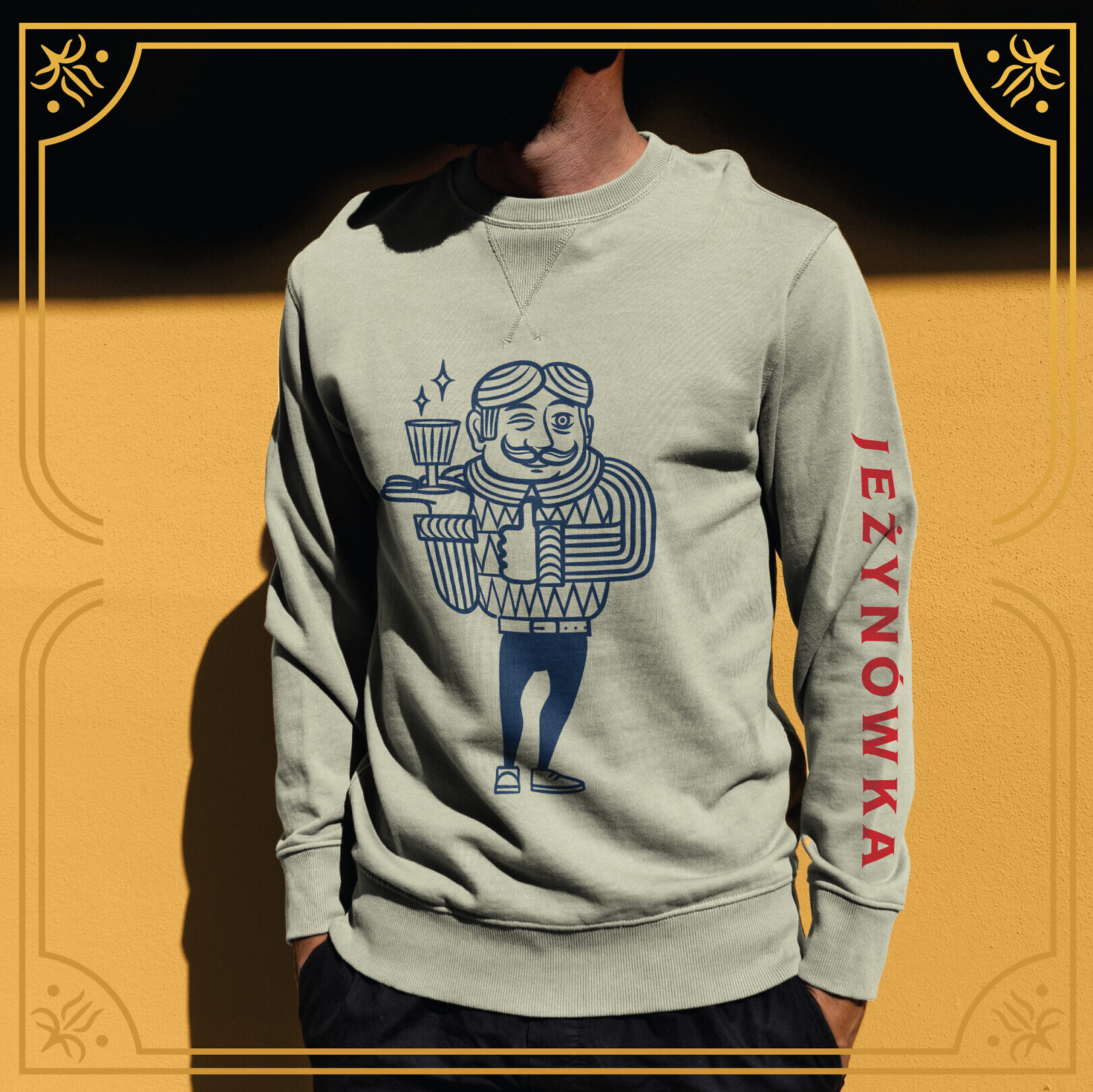
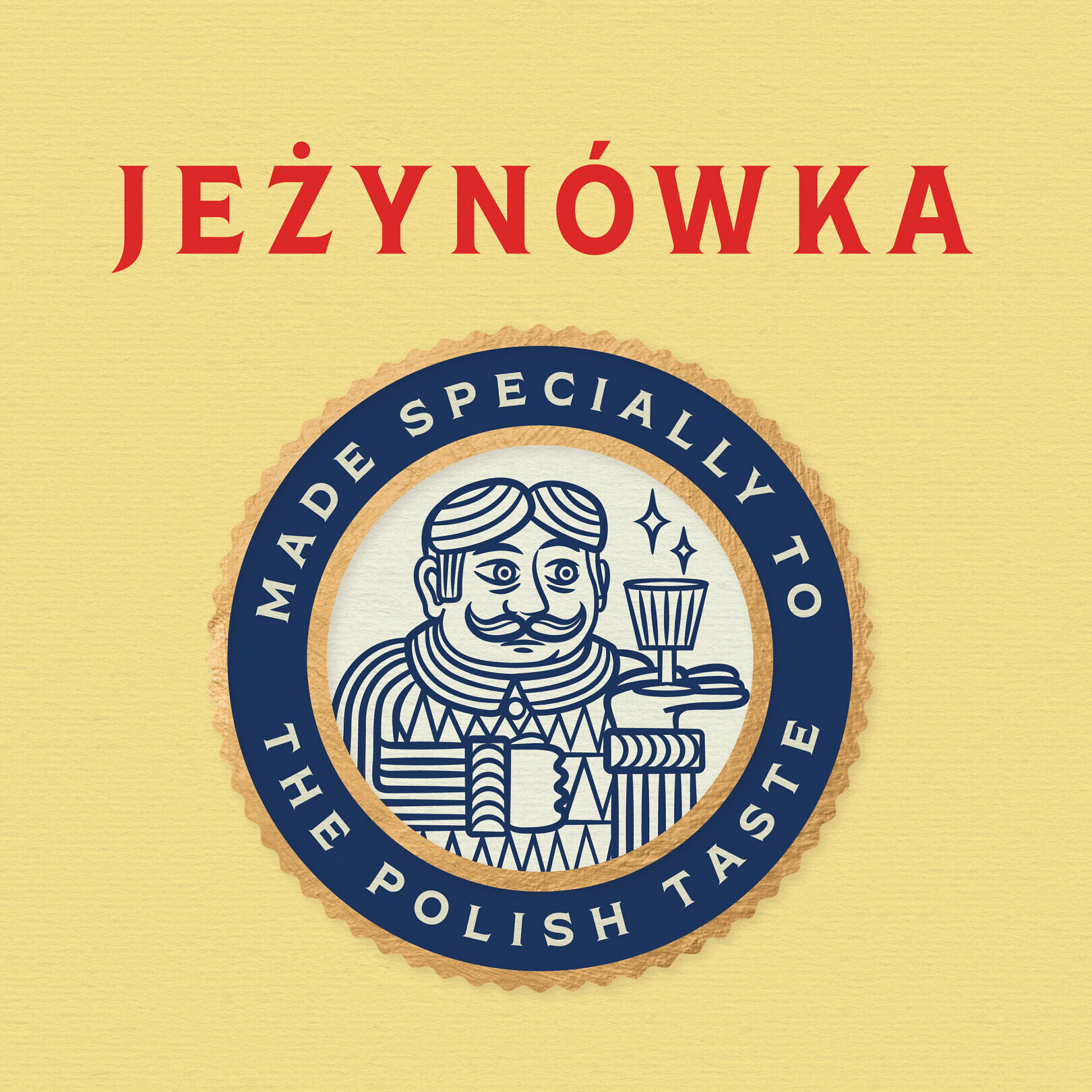
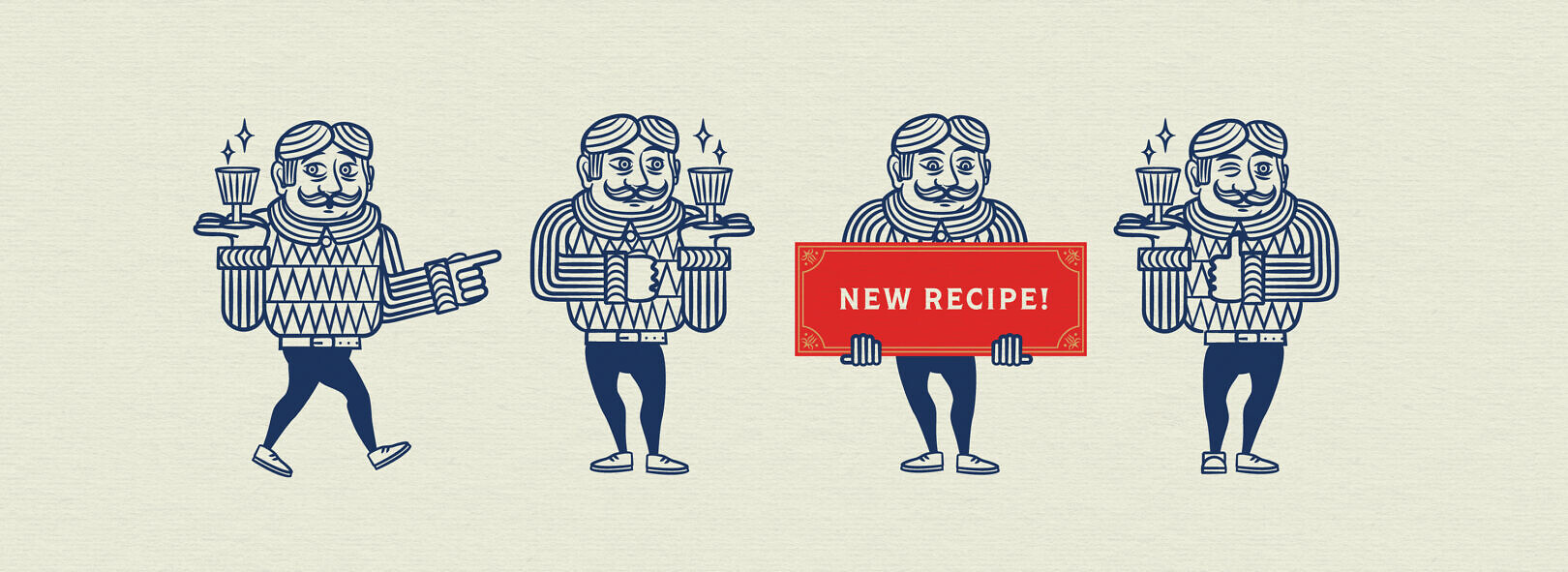
Much of the brand’s equity is rooted in the its Jezynowka Polish Blackberry Brandy, featuring a jolly Polish character and language touting its heritage. We elevated the character to spokesperson for the brand, and defined his personality. “Jez” is an everyman, the consummate host, always ready to celebrate with a knowing wink. With Jez and new tools, the brand is better able to engage consumers, encouraging them to be curious, experiment, and celebrate life.
Extending the Brand System
The identity system was developed to accommodate a wide range of brand expressions, on premise and off, on primary and secondary packaging, in social media and other applications. With new tools to activate, the brand is able to more fully engage consumers, encouraging them to be curious, experiment with new cocktails, and celebrate life.