Gold Bond
- Brand Identity
- Iconography
- Packaging
- Portfolio Architecture
Championing an iconic brand
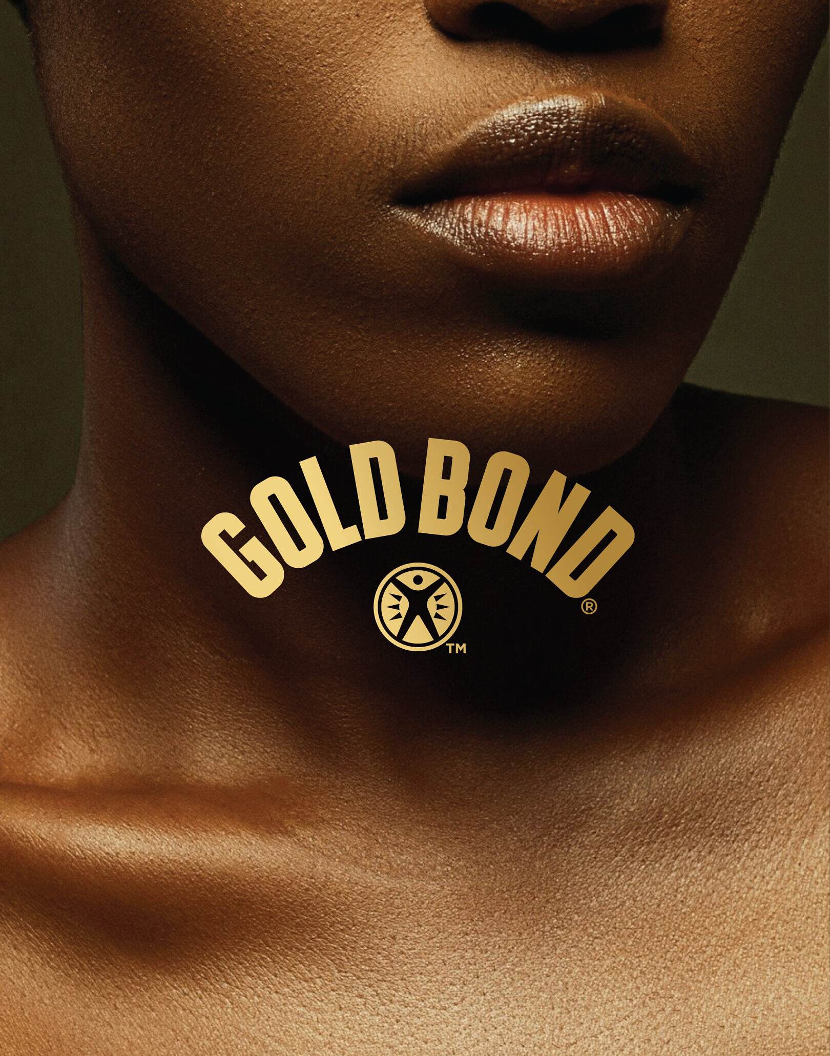
Gold Bond has been innovating skincare since 1908, but its share was challenged with a fragmented identity and the constant churn of new competition.
We unified the brand under a single identity, reinforcing old equity with new relevance and purpose, and added iconography to signal the brand’s commitment to healthy skin.

The packaging portfolio solves a complex puzzle, organizing the system with a consistent information architecture. Considering product categories, claims, legacy colors, iconography and packaging forms across over 100 SKUs, we created a strong system that improves Gold Bond’s shopability. The redesigned system has a strong, consistent presence within complex retail environments.
Reminiscent of its strong heritage, Gold Bond projects confidence, offering innovative products that inspire consumers to champion their skin.