Robins Kaplan LLP
- Brand Identity
- Environment
- Iconography
A Premier Brand for a Premier Law Firm
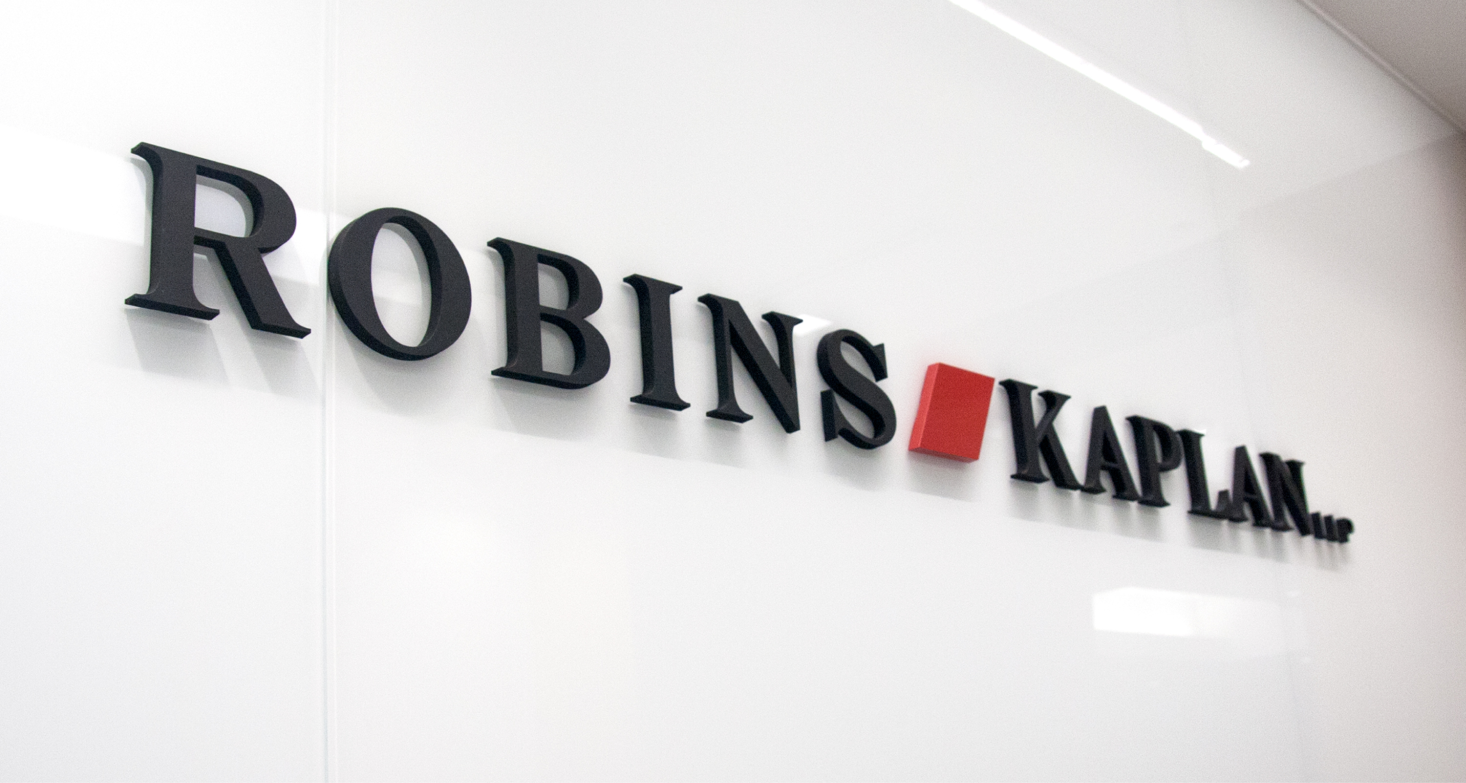
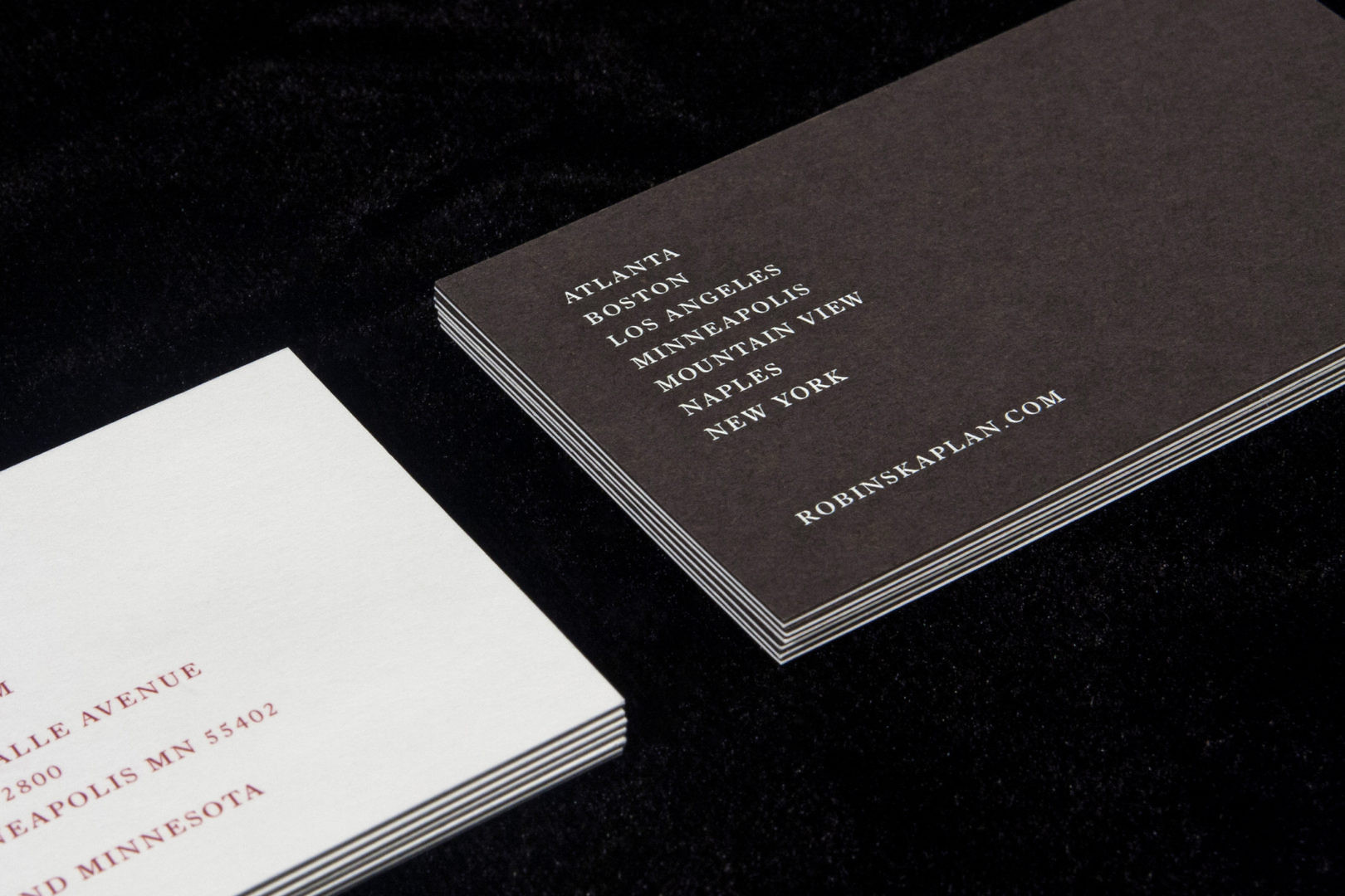
In 2015, the highly respected law firm Robins, Kaplan, Miller & Ciresi was renamed Robins Kaplan, prompting the need to quickly prepare a new identity. More than that, the firm saw an opportunity to create a brand with a strong point of view representative of its reputation and promising future. It also needed to evolve its operating model from practice-focused to industry-focused, shifting its persona from a Minneapolis-centric office to that of a national firm.
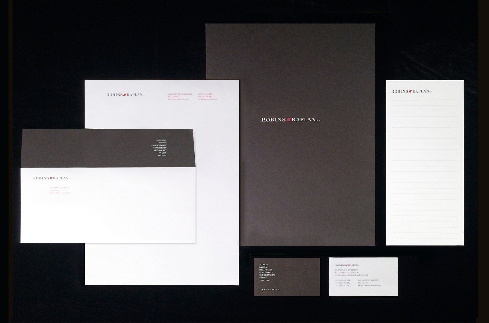
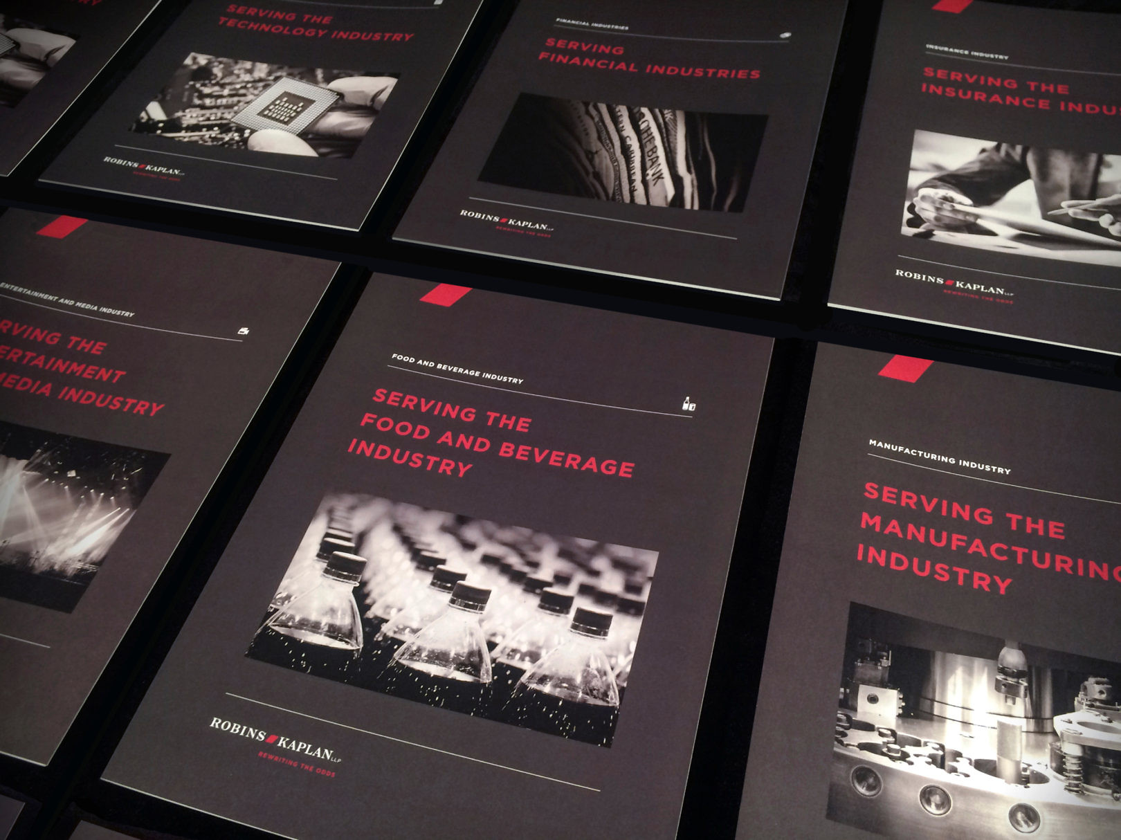
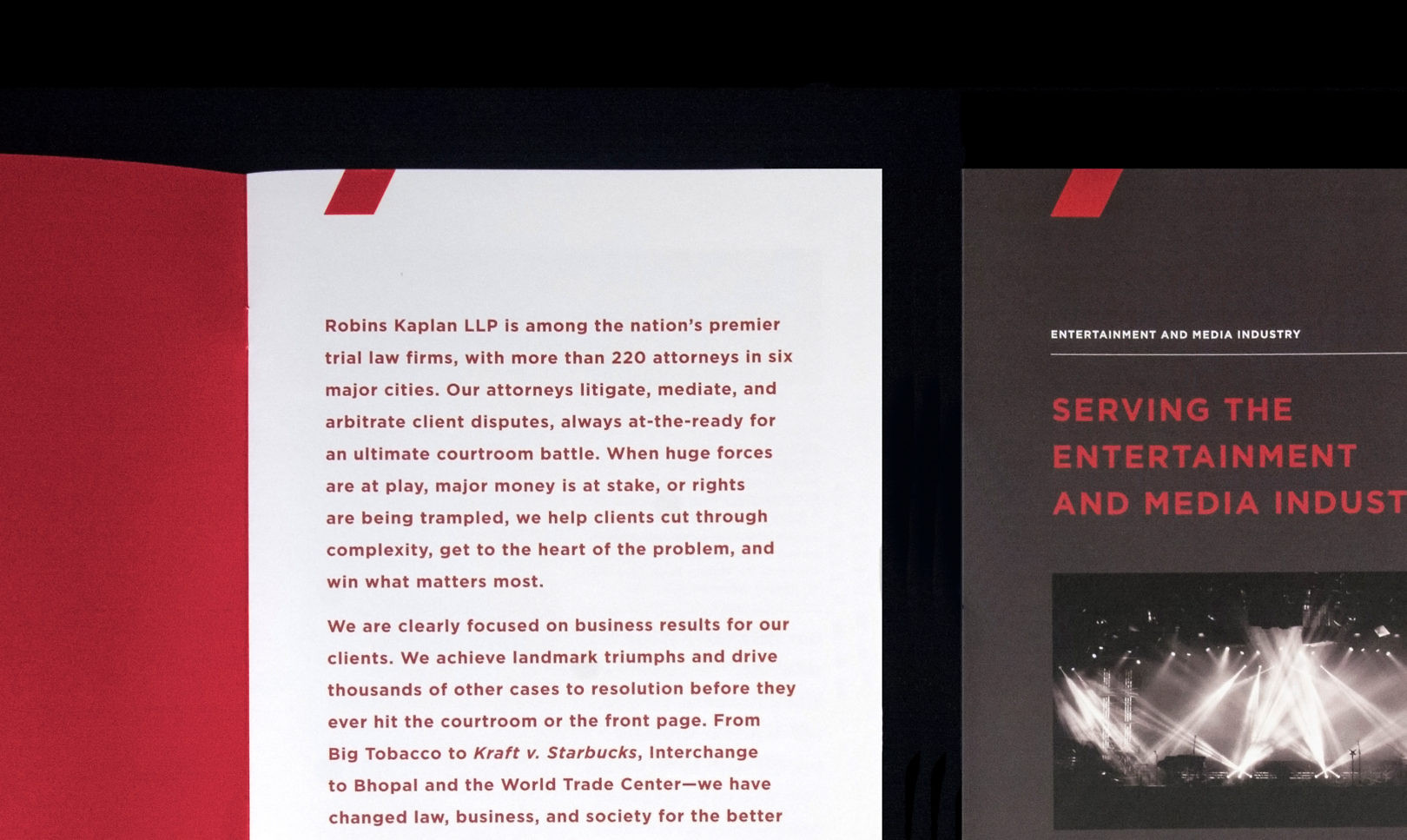
The new brand used a consistent, confident voice, supported by focused messaging, imagery and iconography. Communications articulated the firm’s capabilities by industry. From signage for each location, to collateral, and branded hospitality items in conference rooms, every detail was considered in representing this premier trial law firm’s reputation.
