Panoptix By Johnson Control
- Brand Identity
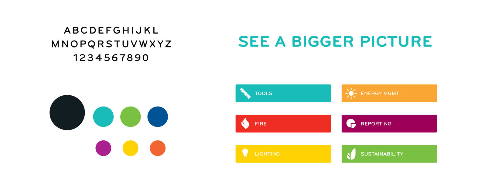
- Digital
- Iconography
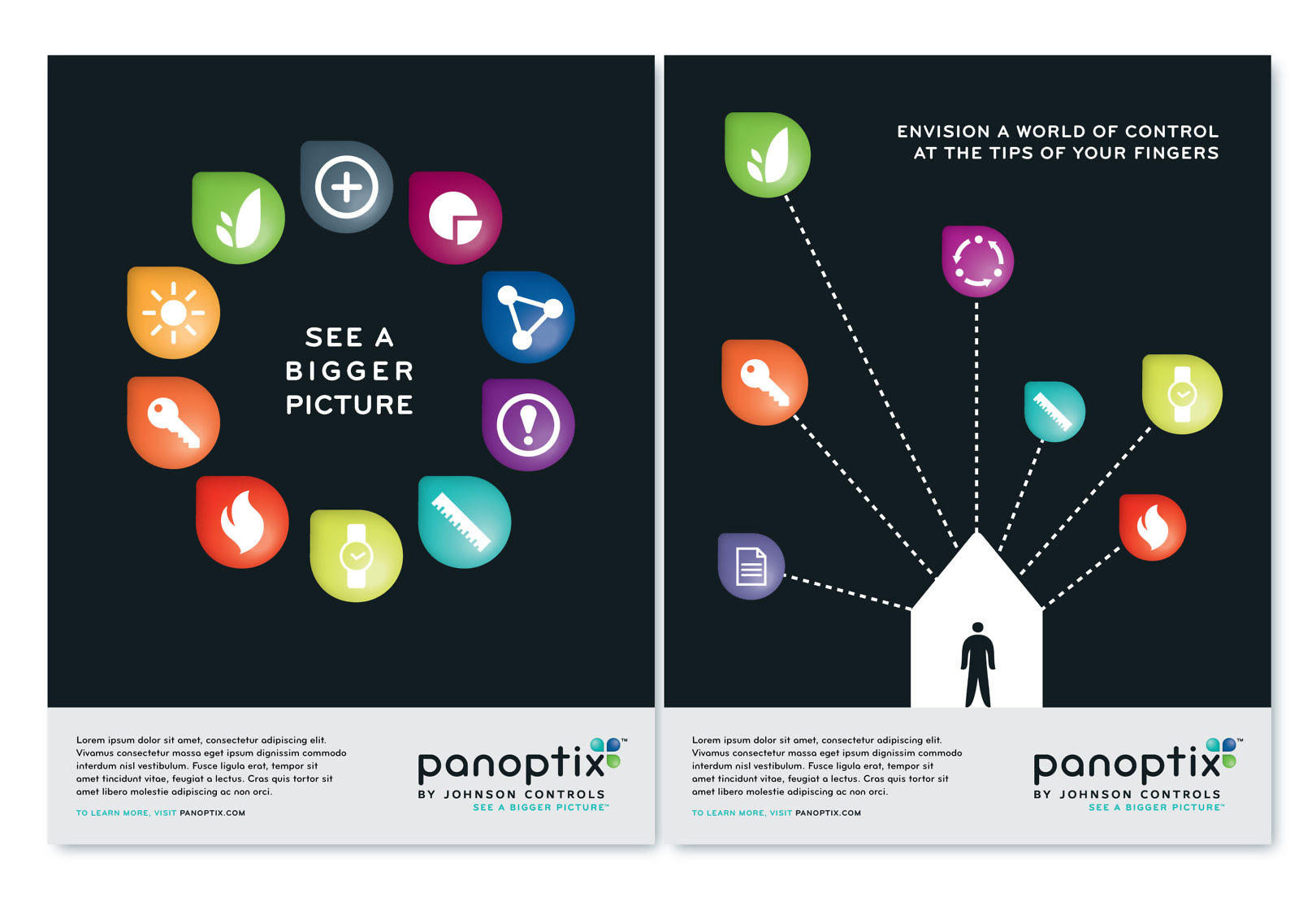
A new vision for energy efficiency
Panoptix by Johnson Controls is an innovative approach enabling building owners and operators to optimize efficiency and performance more cost effectively than ever before. Teaming up with Hen’s Teeth Branding, Cue developed the brand identity, look and feel, and communications to introduce this new way of thinking to the world.


To frame Johnson Controls as a thought leader in the building efficiency industry, we created an animation to introduce Panoptix™ and promote its vision for a world of experimentation, improvement and control. The video was shown internally to socialize the idea within the company, then was used to introduce the concept at the Greenbuild 2011 conference. Print formats for ads were created to communicate the idea more broadly.