El Jimador Tequila
- Brand Identity
- Iconography
- Packaging
- Portfolio Architecture
From Mexico to the World
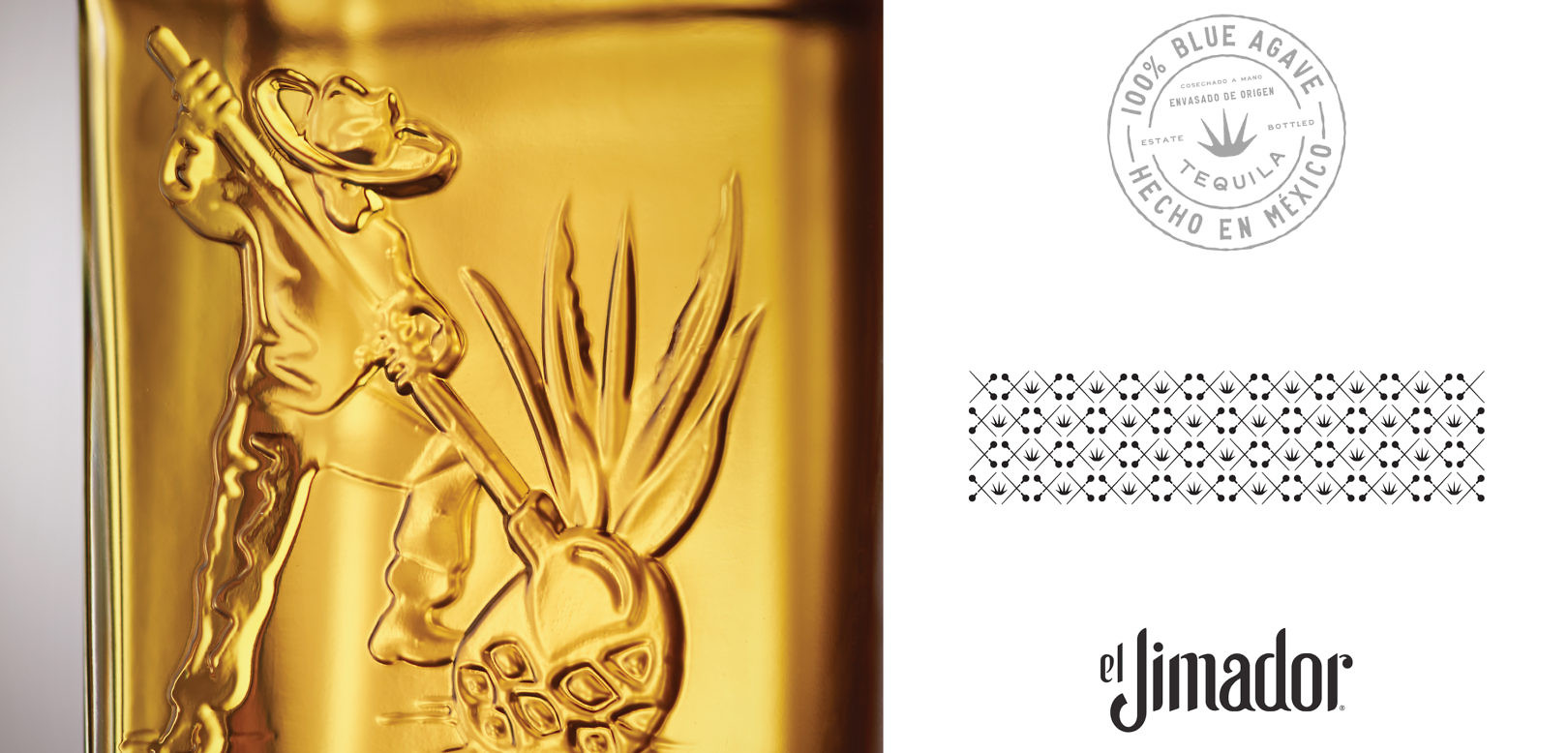
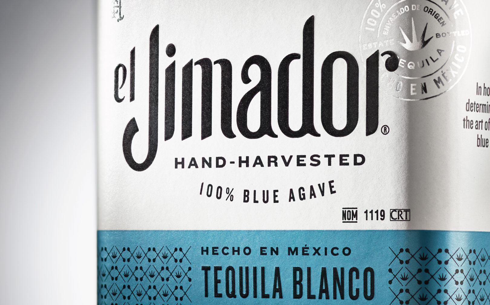
El Jimador Tequila had grown to be the number one selling tequila in Mexico. The brand needed a more premium expression to compete in a saturated U.S. market without alienating loyal Mexican consumers.
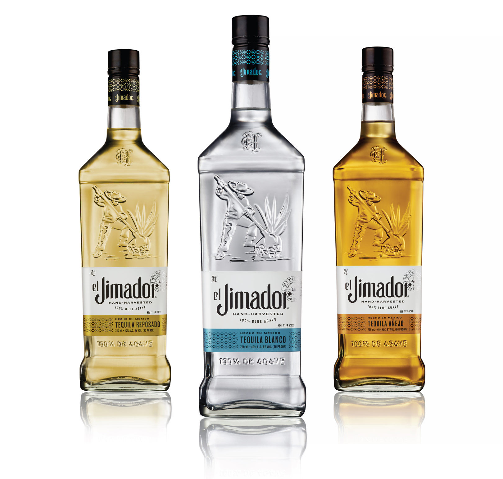
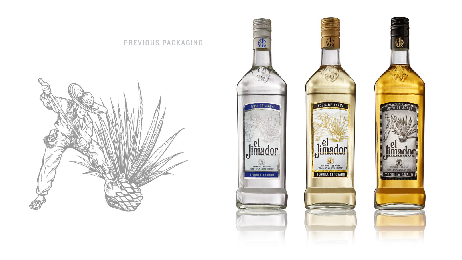
We created a new elevated expression of the brand, validating equities with consumer insights.
We gave the bottle a stronger silhouette, and an embossed jimador on the bottle to strengthen the brand icon. New brand language was created to tell a more complete story, using a seal to authenticate el Jimador’s provenance within the Casa Herradura family. Metallic colors differentiate blanco, reposado and añejo expressions, and a motif of agave and coas reinforce el Jimador’s hand-harvested story.