Southern Comfort
- Brand Identity
- Packaging
- Portfolio Architecture
Southern Comfort had many of the ingredients necessary to make a great brand–authentic roots, rich history, strong name recognition–but had lost its relevance. A trip to the heart of New Orleans revealed that the soul of the brand could still be found where it originated. Along the way, we discovered a story that, like the product itself, is genuine, intriguing, and inviting.
All Roads Lead to New Orleans
From imagery to iconography to typography, Southern Comfort is rooted in the culture of New Orleans. Our exploration of New Orleans revealed a place richer and more diverse than the cliche of Bourbon Street. One of the oldest cities in America, New Orleans is the product of a variety of cultural influences–vibrant, authentic, and inspiring.
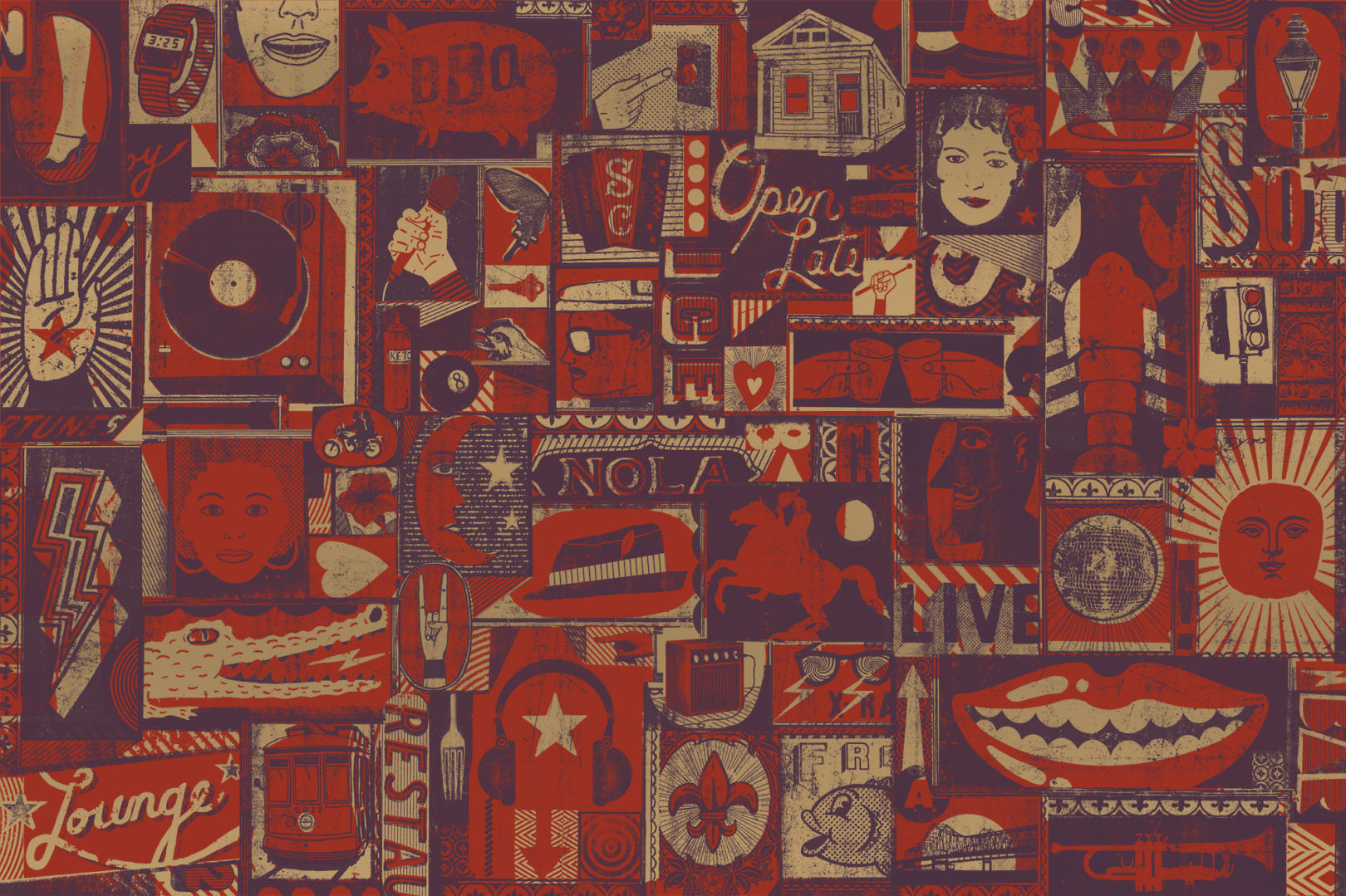
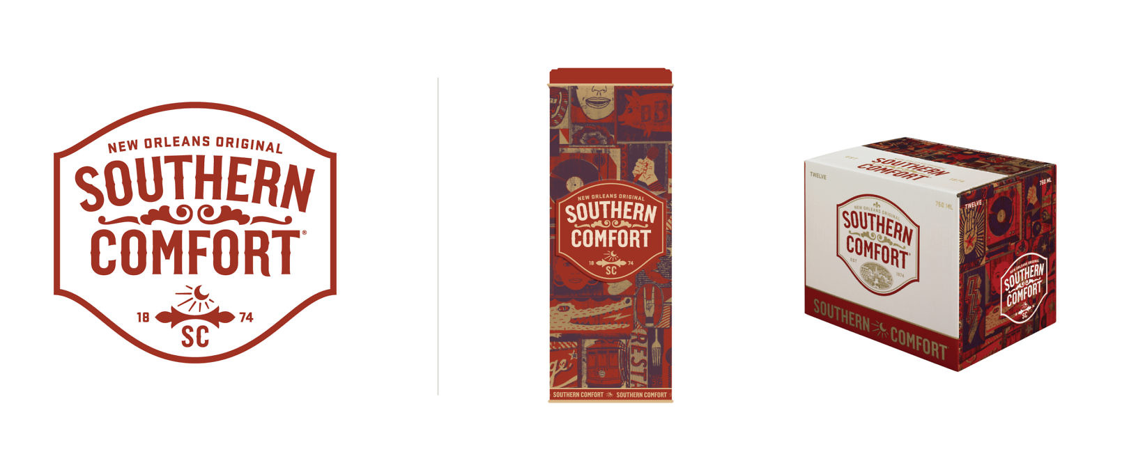
We invited artist Christian Northeast to help capture the energy and vibe of New Orleans. The result is a collage of rich, eclectic imagery that not only conveys a sense of the city, but translates to just about anywhere people enjoy life.
Building on a Legacy
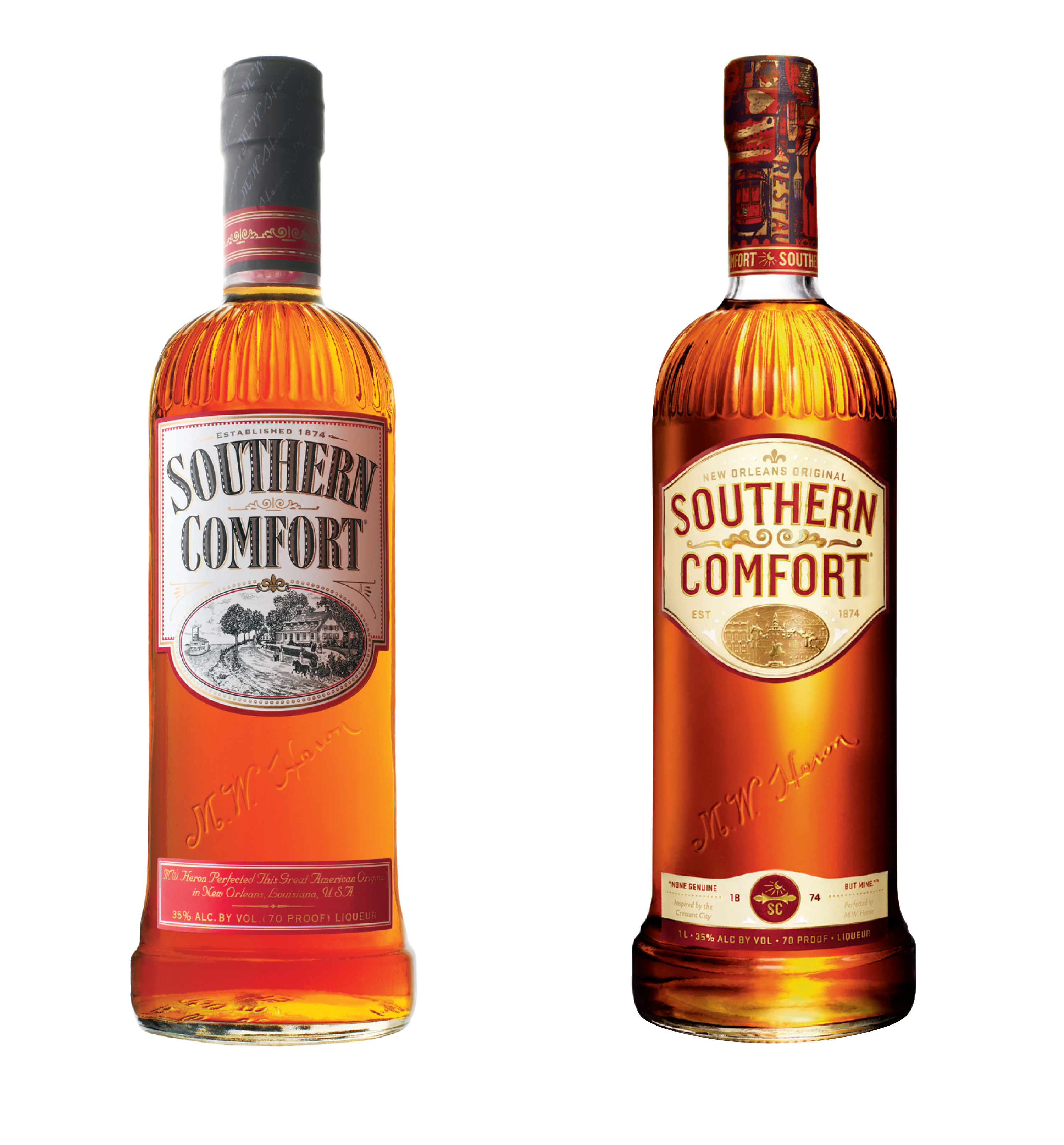
It was important to weigh existing equity against opportunity for improvement. Southern Comfort had high consumer awareness but had lost relevance over time. We retained the familiarity of the label, but looked to the brand’s heritage for inspiration.
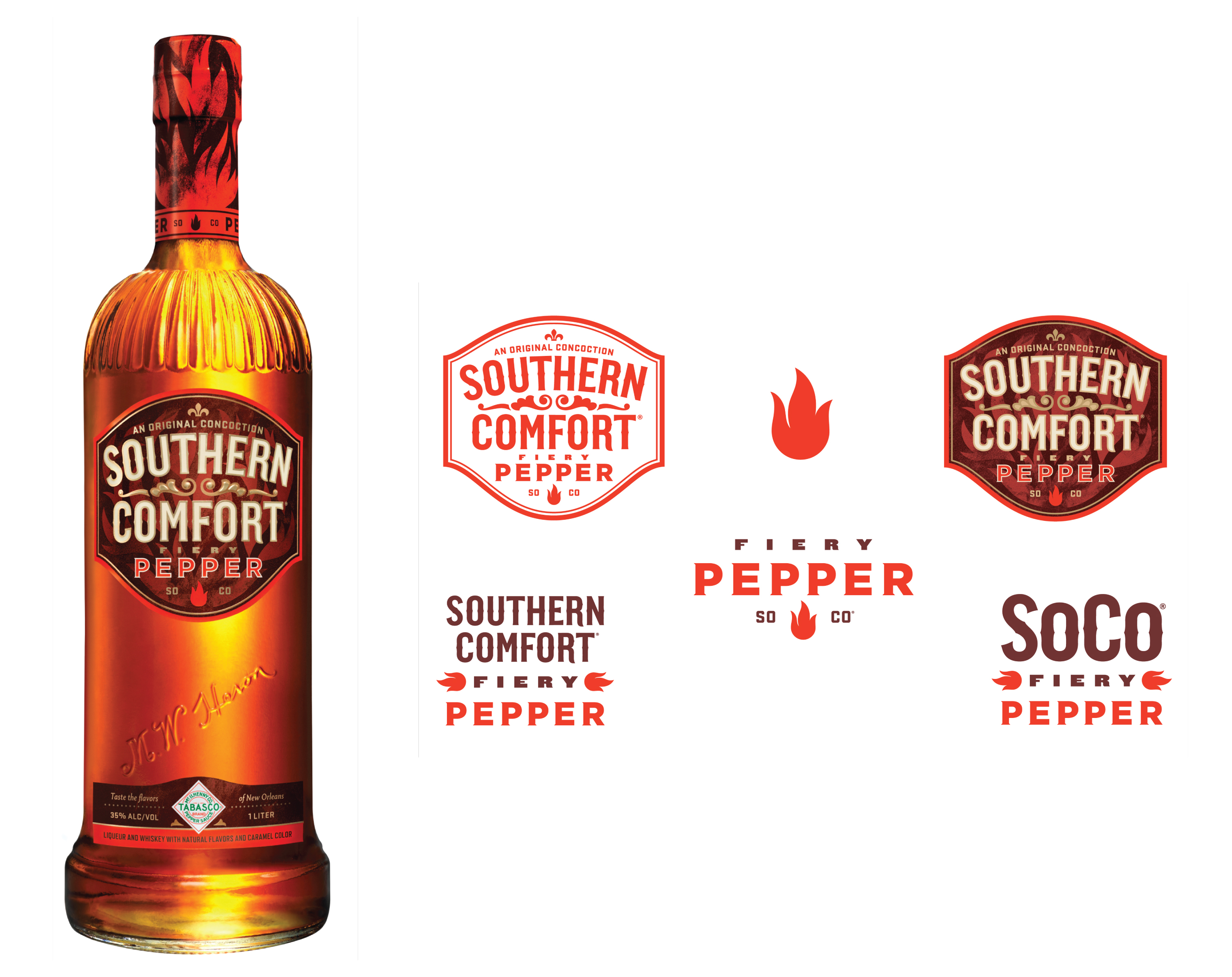
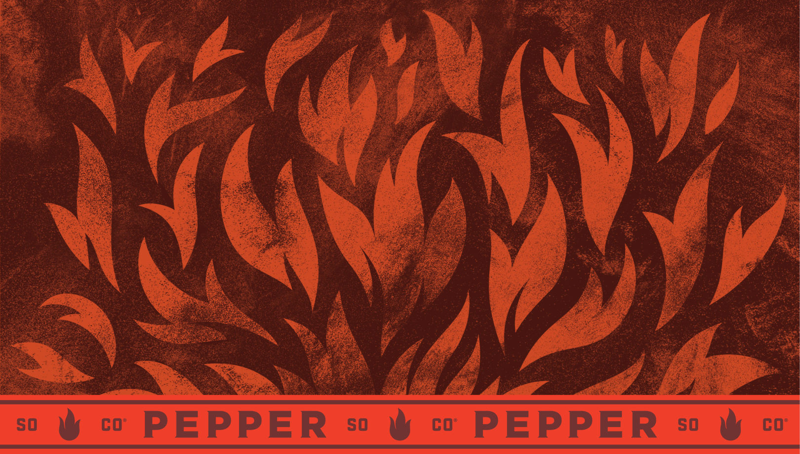
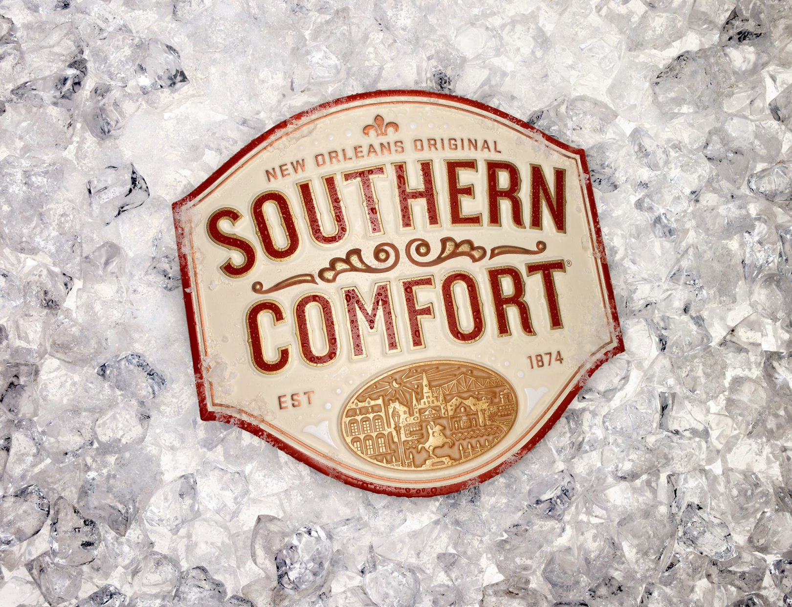
The bottle was one of the more iconic and authentic components retained from the existing packaging system. The new label shape was created to work with it and enhance its unique qualities. The “vibe” of New Orleans is delivered by way of illustration in the neck wrap.
Connected to the Core
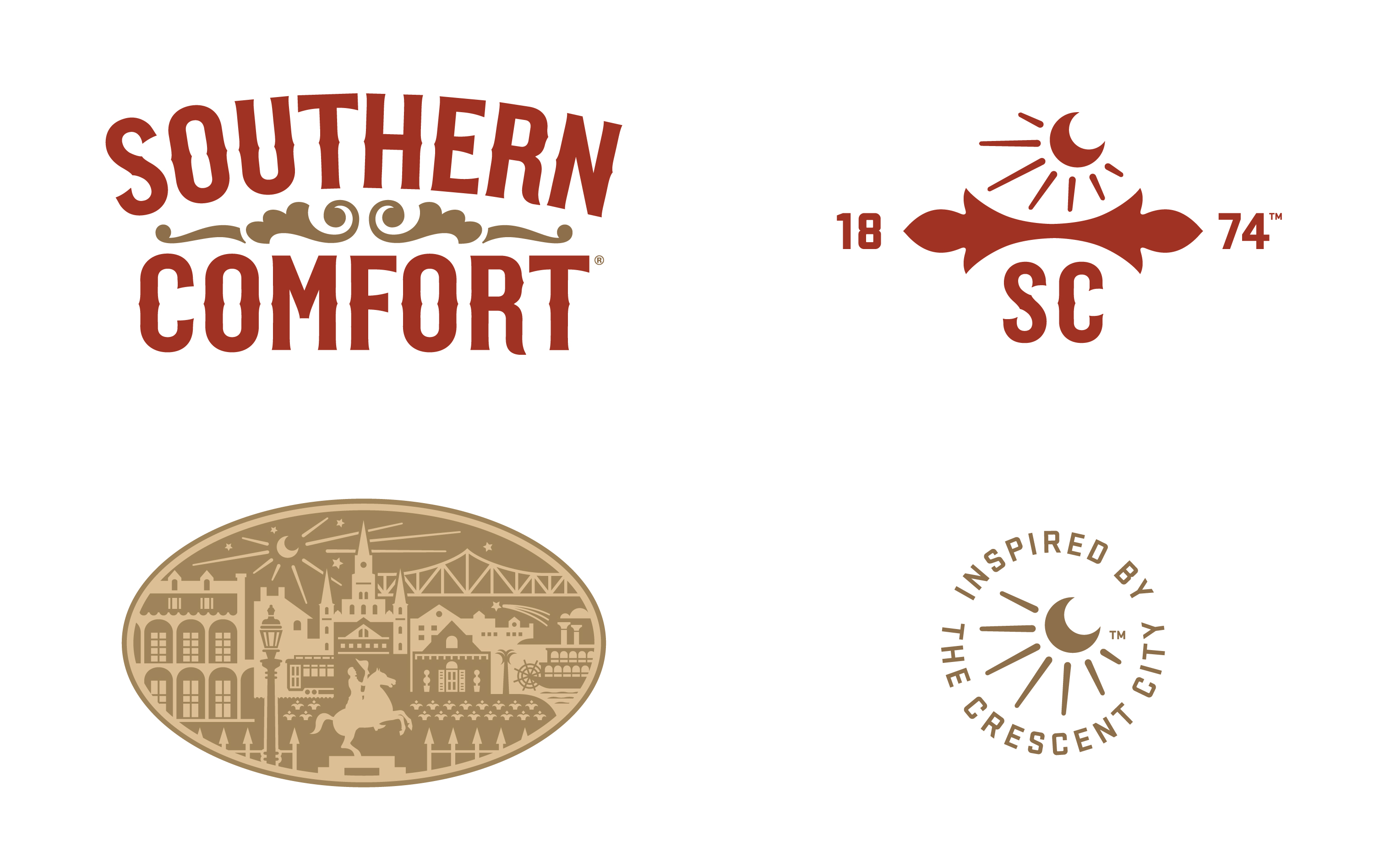
Southern Comfort brand iconography emanates from elements within the primary package. Original typography, brand shorthand, imagery, and label shape are activated in unique ways. The system is rich and extendable, but connected to the core to strengthen the brand and create consistency.
Extended Brand System
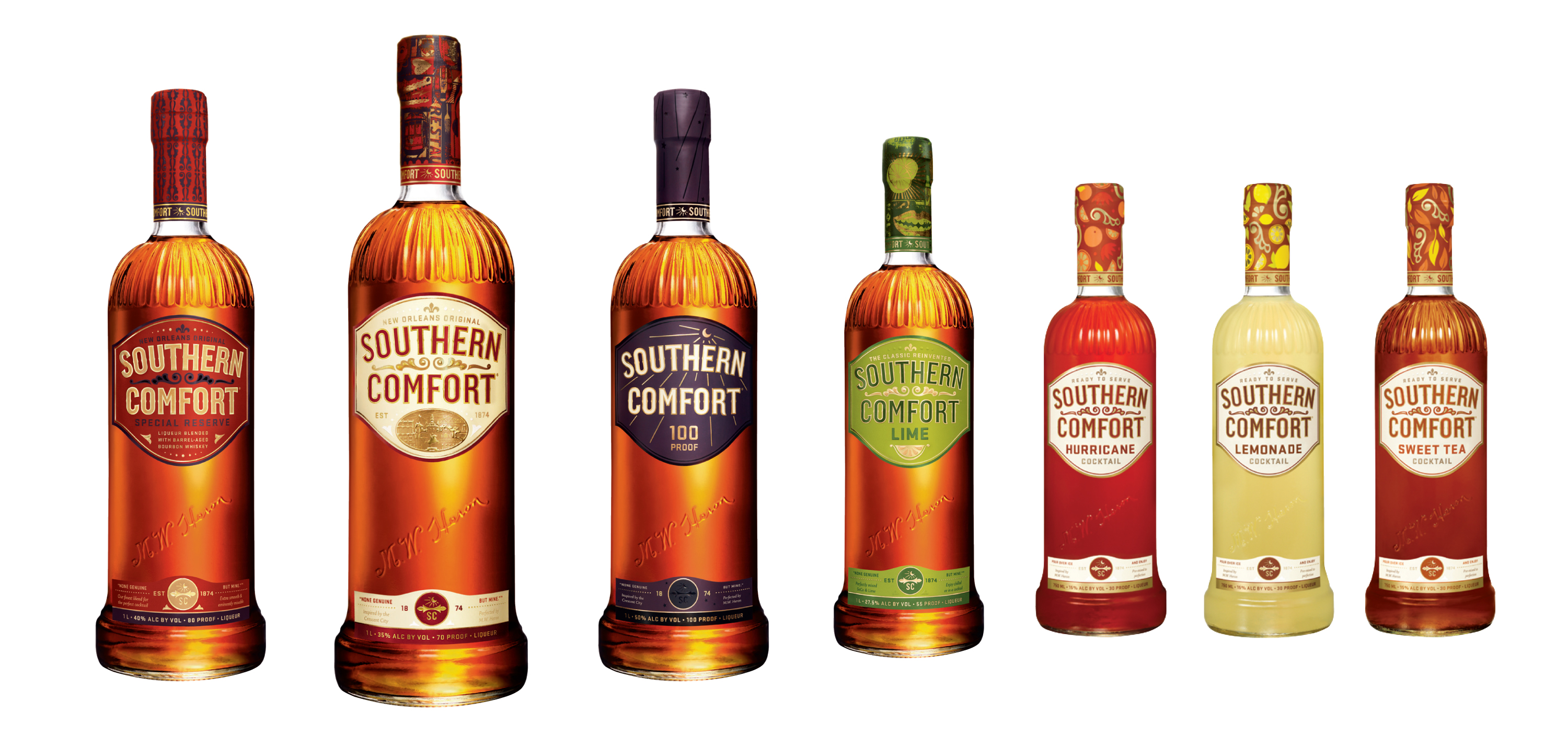
Whether emphasizing the brand’s premium position, delivering more masculine cues, or creating flavor and color systems, product extensions expand the brand language while retaining strong ties to the core.
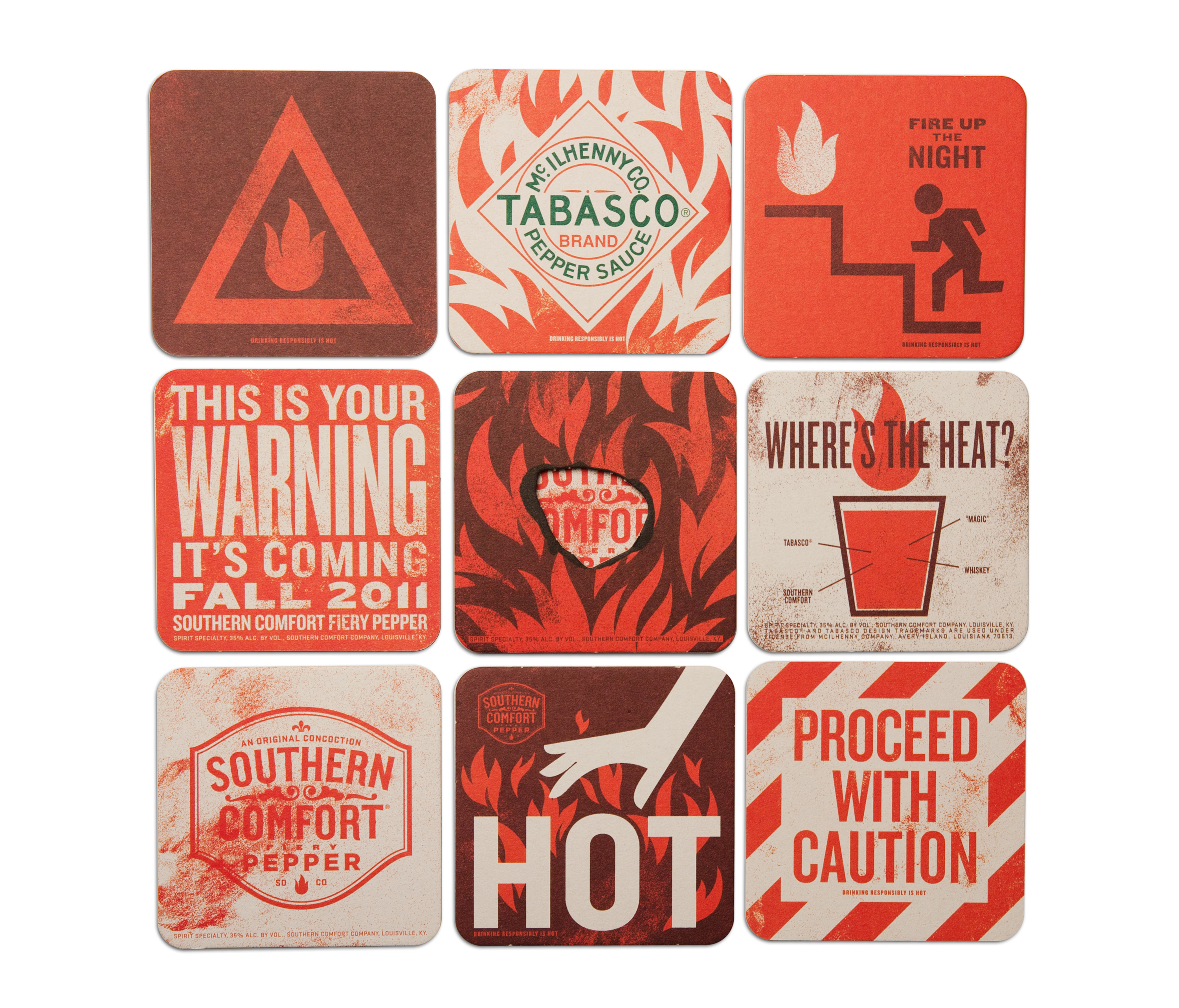
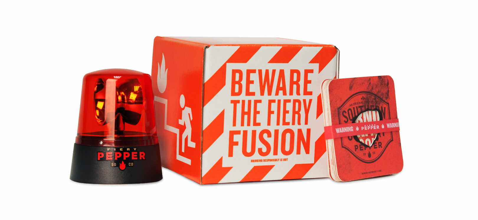
The visual language is designed to be highly extendable, bringing the brand to life in unique ways across a variety of venues. The brand avoids a cookie-cutter approach by providing on-premise, point-of-sale, and other brand experiences that are original and appropriate at each point of contact with consumers.

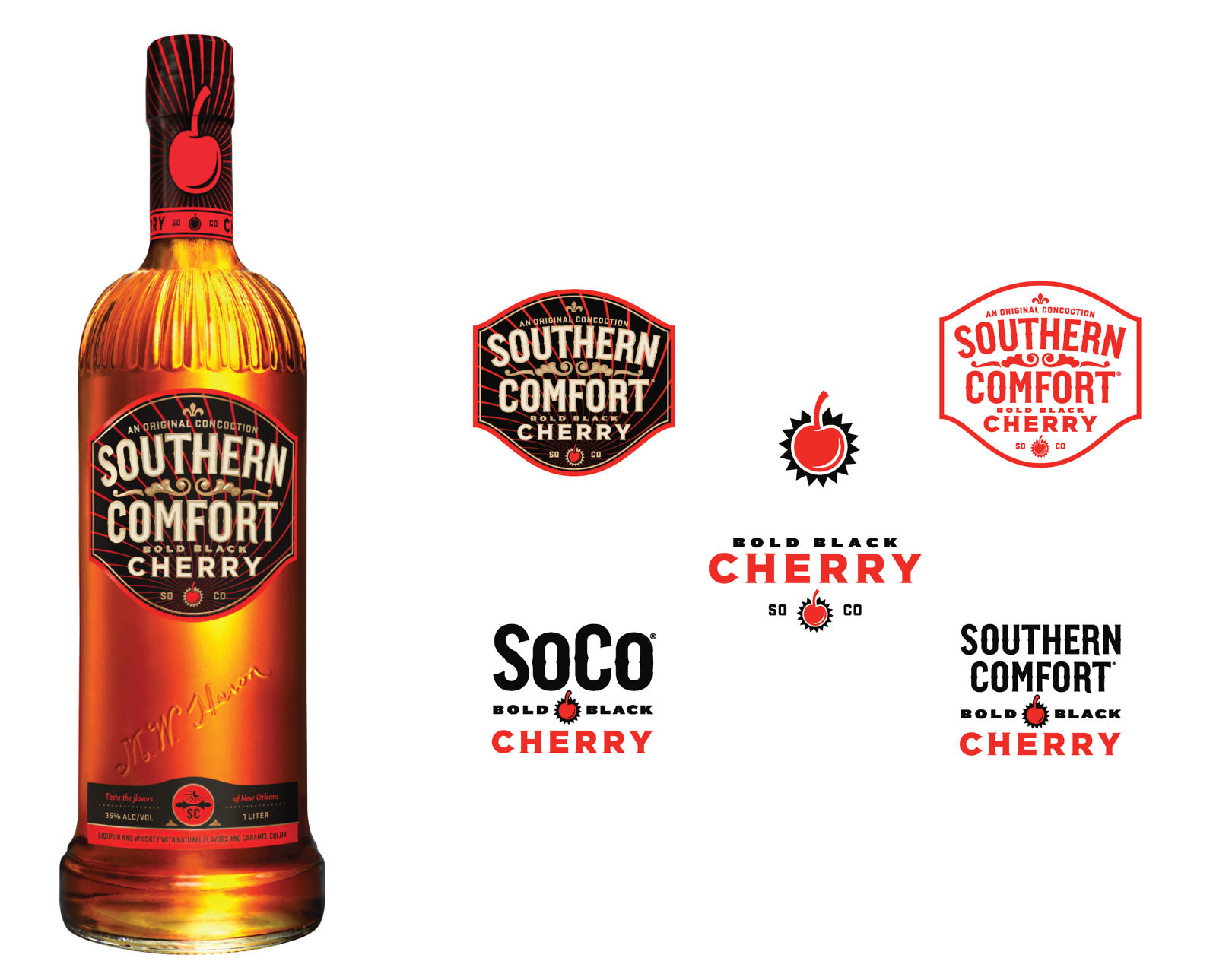
Southern Comfort Flavors
Southern Comfort Fiery Pepper and Southern Comfort Bold Black Cherry promise unique flavor experiences and invite new consumers into the Southern Comfort brand.
