John Barr Whisky
- Brand Identity
- Digital
- Packaging
- Portfolio Architecture
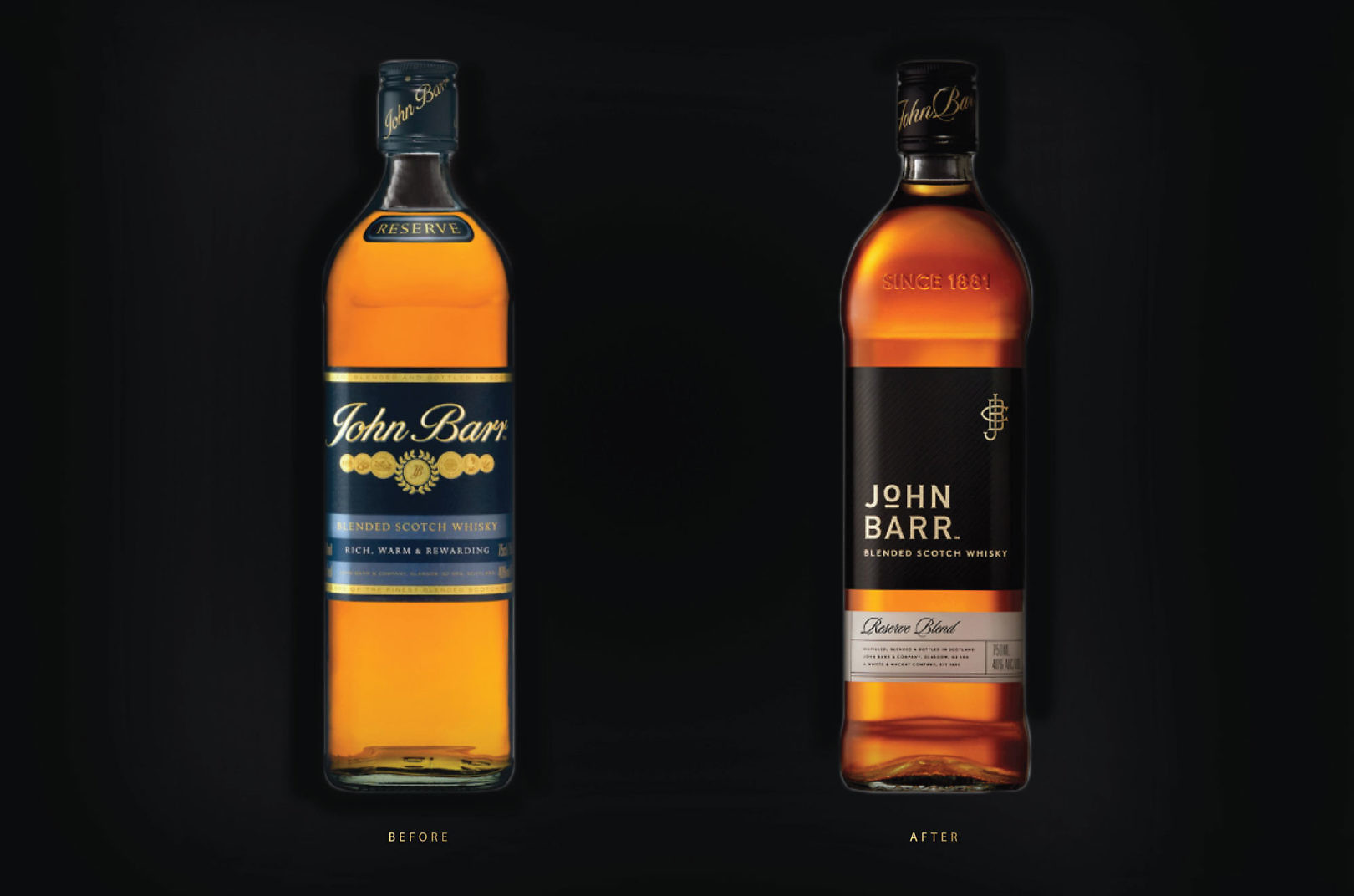
John Barr was an award winning Scotch whisky from times past, but the packaging lacked quality cues. Owned by Whyte & MacKay, the John Barr brand asked Cue to redesign in preparation for a re-launch, with new design and improved spirit.
Our proposition “Tradition Forward” inspired a new design for John Barr Reserve (black) and Finest (red) Blends. We evolved the bottle silhouette and retained color references, but pushed the brand boldly forward, embodying a more forward-looking label expression to stand apart on shelf.
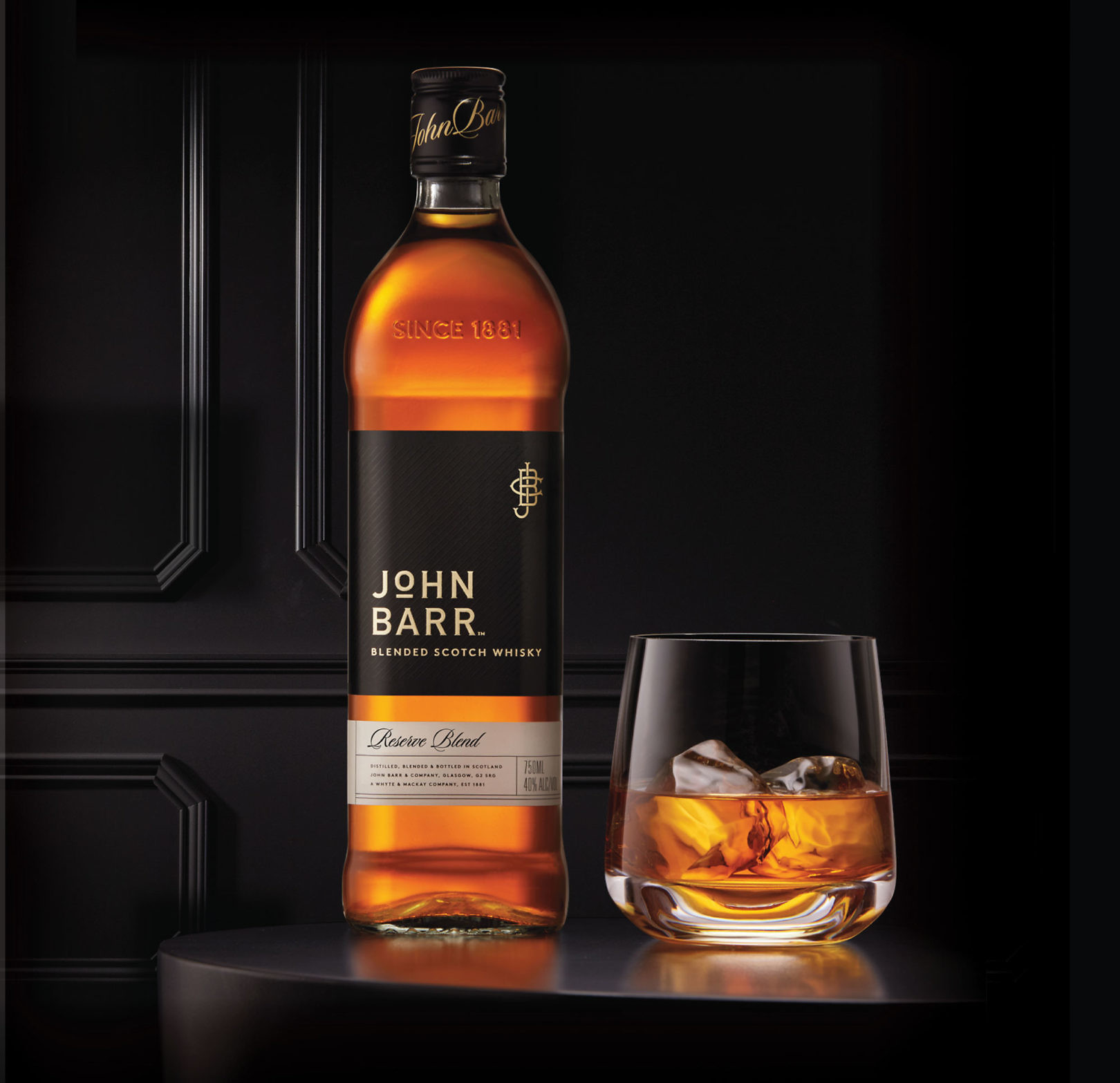
Reserve Blend
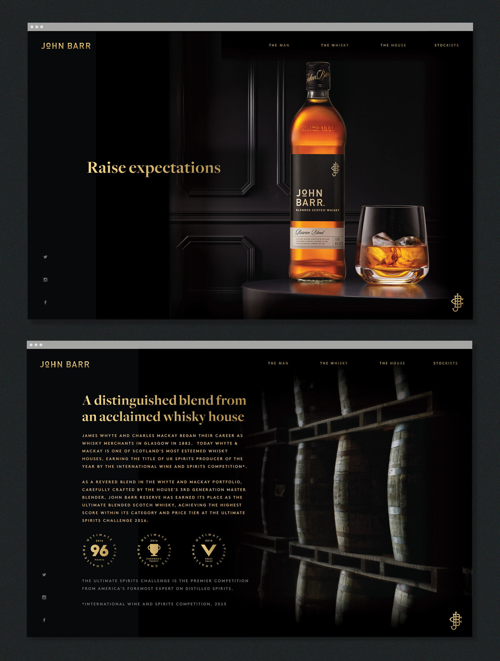
The newly formulated John Barr Reserve Blend was awarded the ultimate Scotch whisky in its category and price tier at the Ultimate Spirits Challenge 2016. The new brand look supports this premium position with a new design. Adding “Since 1881” to the bottle pays homage to Whyte & MacKay’s longstanding whisky credentials. A newly crafted brand expression incorporates a wordmark and monogram along with refined label treatments that balance traditional whisky cues with a modern premium expression.
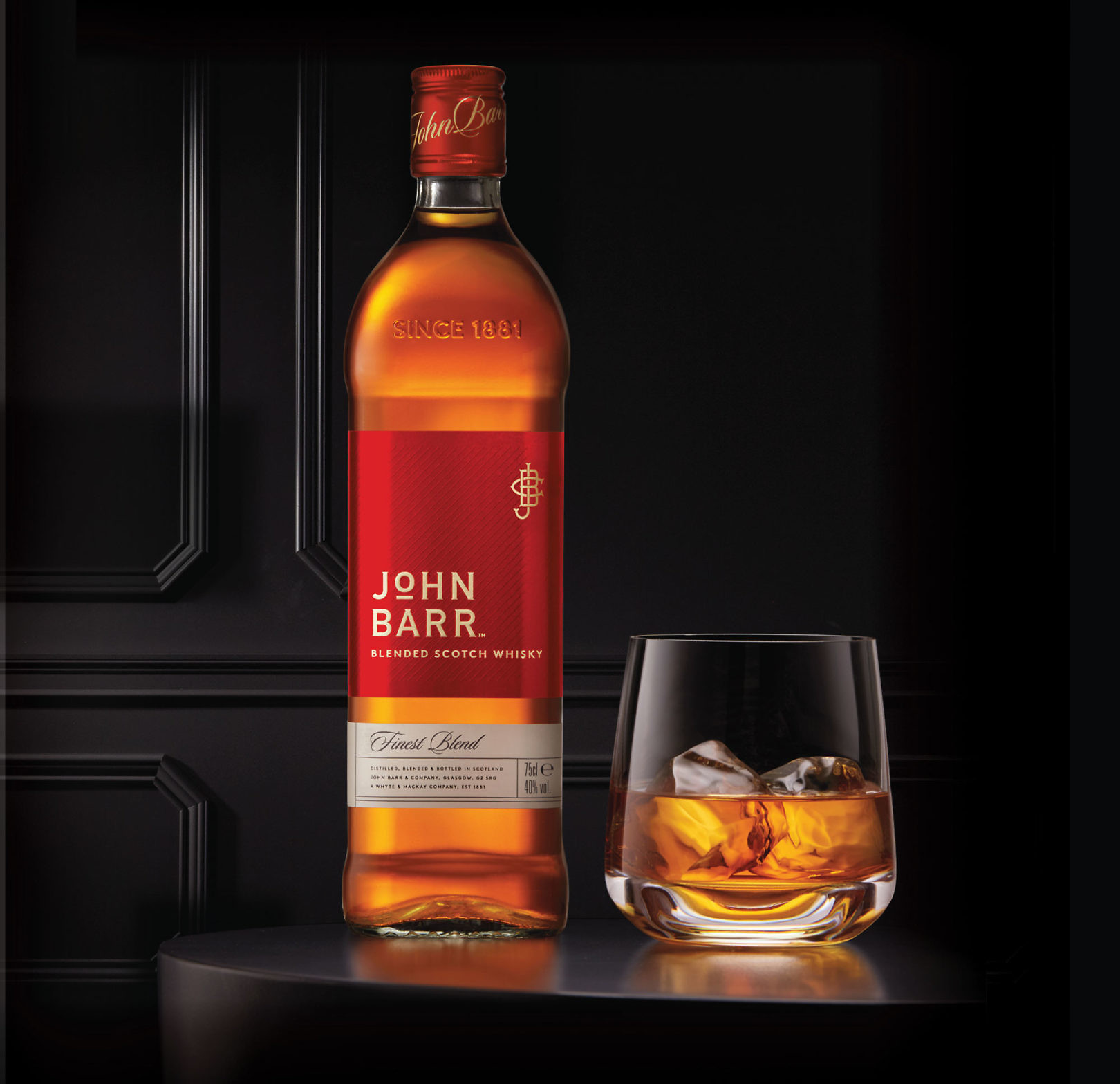
Finest Blend
John Barr Finest Blend is the second Scotch in the brand’s portfolio, utilizing the same architecture of elements, and its own bold brand color (red).
John Barr, the Man
In the 20th Century, John Barr was widely known in his homeland as a first class whisky man. Traveling the globe as an ambassador of his country’s signature spirit, John Barr is renowned for bringing a richer style of blended Scotch whisky to the world. His namesake whisky honors this legacy, raising expectations once again.
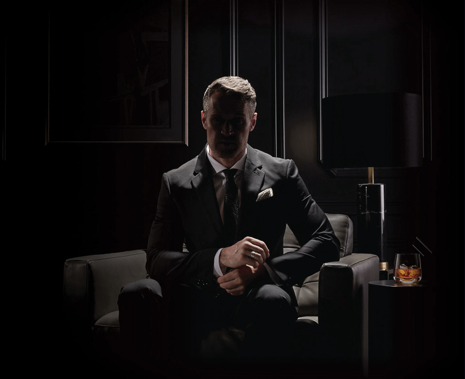
Expressing the Brand
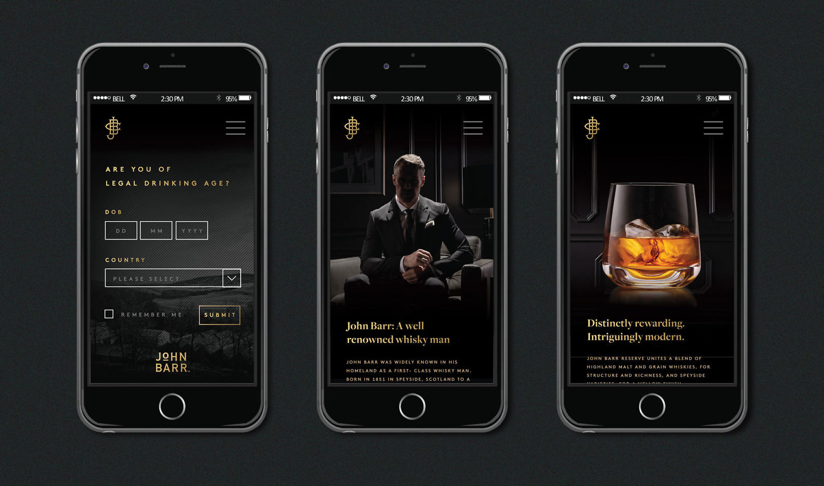
Applications, from website to point of sale were created to launch the new John Barr brand. “Raise expectations” communicates that John Barr is worth serious consideration.
The website is expressly simple and premium, using bold color and imagery to stage the product and to make a strong brand statement.
Old and New