Portfolio 1-on-1
A promotional identity for an AIGA MN event providing design students an opportunity to discover how their work measures up to professional standards.
Logo, wordmark, identity, trademark, badge – all are different terms used to describe the singular, and perhaps most important, expression of a brand. Of course, a brand is more than just a logo. It’s the sum total of meaning that resides in a consumer’s mind – impressions from a logo, color, iconography, package, advertising and more. A well crafted Brand Identity Design represents a brand in its most succinct expression. We think of brand identity as part of a proposition that can be expressed in every relevant way. Our expertise involves the creation of symbols, typography, color and more, to either improve a brand’s meaning or by creating something wholly new to the world.
A promotional identity for an AIGA MN event providing design students an opportunity to discover how their work measures up to professional standards.
Rebranding the iconic American outdoor brand that made fishing an easy way to explore the outdoors.
Homedog Co. believes every dog deserves a home, so we created an identity that complements and supports the company’s dog rescue efforts.
Hand-drawn type captures a bit of the exotic for a coffee with provenance from the renouned Hacienda La Minita in Costa Rica.

Red River is a hopeful place; a bridge for people in crisis to get back to their (extra)ordinary lives.
An award winning Scotch whisky from times past, we gave the brand a much needed redesign to reflect the proposition “Tradition Forward”
A custom wordmark adds some adventure and youthful energy to “good-to-go” boxed wine.
When redesigning the packaging for this famous whiskey icon, we made sure to respect the brand’s legacy, hoping too, that we’d have made Mr. Jack proud.
Sheepdog was founded to offer promising startups modern solutions to navigate marketing complexities - activities that require shepherding multiple facets and partners.
Simple, crafted typography identifies award winning wines, Italian kinship and hospitality that invites people to live in the moment.
Every year, The Curtain Call Ball raises money for this worthy non-profit. Our theme “Magic Curtain” created an expectation of childlike wonder and sophisticated fun.
A refreshed, hand drawn wordmark is combined with iconography and color to create a system of expressions as diverse as the land it represents.

This network of testing laboratories operates with a keen sense of how important details translate to the big picture. Our name and identity for the brand reflect precisely that.
The Slice app uses technology to connect passionate pizza eaters with authentic pizza, so we created an identity that pairs a traditional typography with a modern, graphic sensibility.
An identity for an LLC formed to manage modest holdings of siblings hoping for a tiny acorn to grow into something more mighty.
This institutional pharmacy brand was inspired by the lotus flower, a symbol that represents new beginnings, overcoming obstacles, and inspiring growth.
Sinatra Select was designed to be both a classic expression of style and an homage to two great American icons who did it each their own way.
When a brand manager decided to go solo, we created a brand icon to symbolize the kind of thinking she brings to successful marketing.
Focused on exceptional food in a welcoming atmosphere, Vivo Kitchen serves everything deliciously, and with a good helping of hospitality.
Southern Comfort Bold Black Cherry teases taste buds with a burst of black cherry, so we created a brand toolkit with elements designed to express it in a big, bold way.
The Mariano Rivera Foundation logo symbolizes the the pitching legend’s faith, and an optimistic commitment to improving the lives of others.
The Better Halves Workshop was designed to get couples talking about the emotional aspects of money, so we designed an identity to give the subject some extra love.

A “North Star” guides this group of behavioral health facilities.
Our nation’s original environmental law organization believes a healthy environment is a right for all. This brand identity conveys this with a bold, active and impactful voice.
This icon was created to live in perpetuity, in memory of Caribou Coffee’s first roastmaster, and a blend of coffee that raises money for Cancer Care.

When in need of a forward looking identity true to past success, we created a monogram worthy of a company that confidently weighs complicated data with simple certainty.
Redesigning Mexico’s best-selling tequila for the U.S. market involved retaining the authenticity and familiarity of the brand while conveying confidence and quality.
Leading the world in small, gasoline engines, Brigg’s and Stratton needed to convey “The Power Within,” a proposition expressing the potential of their engines and those who take pride in real work.
Authentically Jack Daniel’s in a honey liqueur, Tennessee Honey is brought to life with a sweet logo that invites everyone to become a fan of Jack.
How do you explain creativity? This advertising agency needed to present itself in a new way, inviting everyone to rediscover what Campbell Mithun stands for.
To mark 150 years of the Oldest Registered Distillery in the United States, we created a celebratory identity and applied it to two special Tennessee Whiskeys.
Unifying a family of businesses under one unified brand, one icon, one cohesive story.
Cue created a branded look and feel around a new identity, designed to appeal to a thriving community aspiring to live well and live better.
Shift Why empowers high school coaches to change the culture in youth sports by coaching for integrity over victory. The identity conveys this in a most assertive way.
The identity for this enterprise presents a financial consultancy expert in identifying unique synergies between companies poised for mergers or acquisitions.
This independent restaurant concept draws inspiration from traditional diners, serving great American street food in an environment with an upscale vibe.
An outpatient facility specializing in opioid addiction, Valhalla Place provides the strength to fight. We created a badge to support that proposition.
SoCo Fiery Pepper touts genuine Cajun heat, a twist on the whisky flavored liqueur. So, we created logos, icons and brand activation to express its fiery stance.
We re-branded Fast Phone Repair to add credibility, reflecting the high performance team of device repair specialists and a company positioned for growth.
A value-priced alternative to more expensive advertised brand cereals, Mighty Crunch offers a tasty way for superheroes in training to get started in the morning.
A trusted parter of commercial builders, Total Tool is committed to unparalleled service and uncompromised integrity.
Many details add up to make a place truly welcoming. It’s this sense of hospitality that inspired the identity for a restaurant group committed on providing true hospitality.
Double Encore offers development and consulting services for user-focused mobile applications. We created a dynamic identity representing it as intelligent and interactive.
We created an identity system, brand structure, and language to help stakeholders understand the company’s mission to evolve healthcare through advanced use of IT.
We created a new identity for a product with real history to give this premium liqueur new energy and an intriguing personality.
Founded by a former Southwest Airlines executive, this group works with companies to create valuable relationships between customers and brands.
For a craft brewery specializing in European style beers. we created a blackletter monogram. On can, it becomes part of an eclectic mix of modern elements.
Our identity for the world’s first smart, happy, little, full-color, zero-ink, app-enabled printer reflects a personality that’s simple, easy and fun to use.
This simple identity for a national network of construction services portrays an industry leader; a strong and capable company with broad reach.

An architecture studio with a focus on sustainability, Studio 2030 is committed to leaving a legacy that is good for architecture, the planet and all of us.
A craft fwd vodka brand that embodies the natural beauty and urban sophistication of the Pacific Northwest.
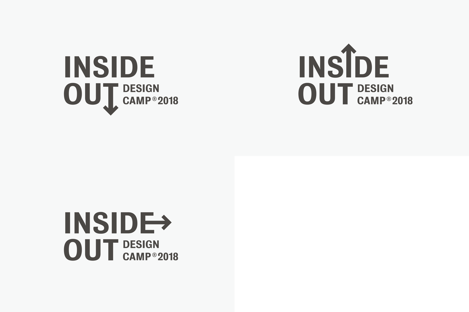
The theme of the conference, “Inside Out,” highlights the merits of investing in personal creative growth, taking risks and expressing a unique creative voice.
Radlyn markets a proprietary device that simplifies intubation. The logo telegraphs the product’s function, but more importantly, credibly represents a small medical company.
For the company formerly known as “Technology Resources Group,” we created an identity to play in in the world of modern consumer electronics.