AI Fire
- Brand Identity
- Environment
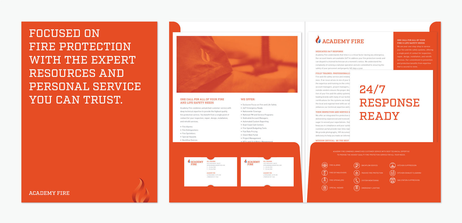
AI Fire has built an entire organization focused on fire protection services. It has the scale and experience to serve large clients through its Academy Fire call center. At the same time, it is rooted in personal customer service at the local level with field teams from Impact Fire. To unify the businesses, we created a fresh new brand, one that honors each company’s past, looks forward with a strong visual language, and gives the brand a differentiating presence in the category.
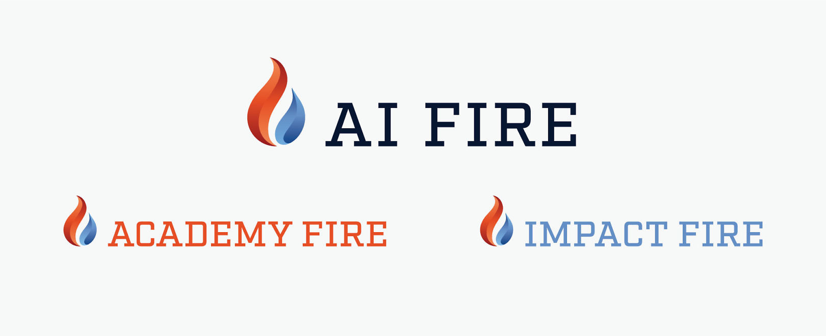
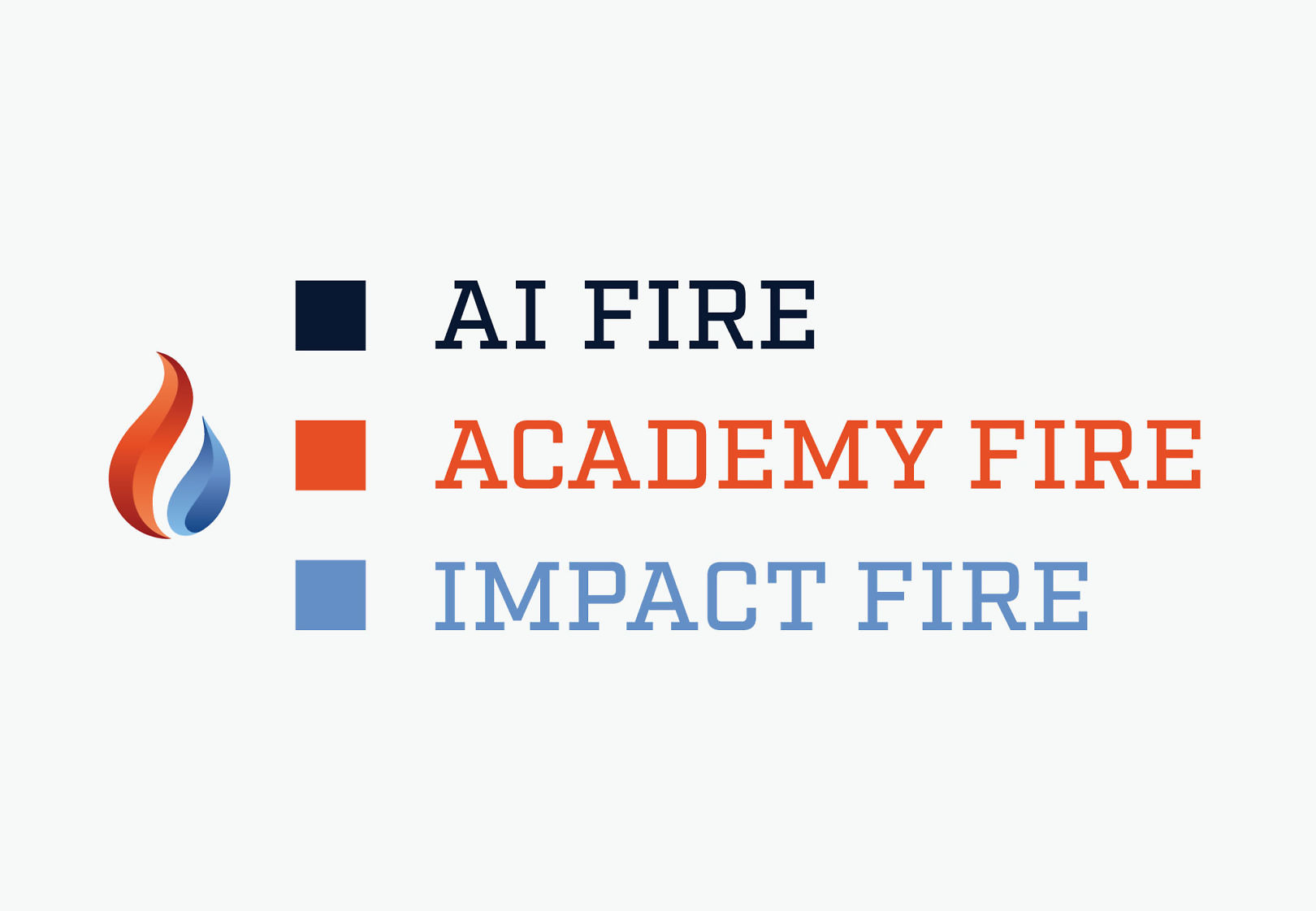
AI Fire uses a dynamic flame icon to represent fire prevention and protection. Each sub brand uses the flame icon, a legacy color and common typography to provide a measure of autonomy in a system that unifies all three entities.
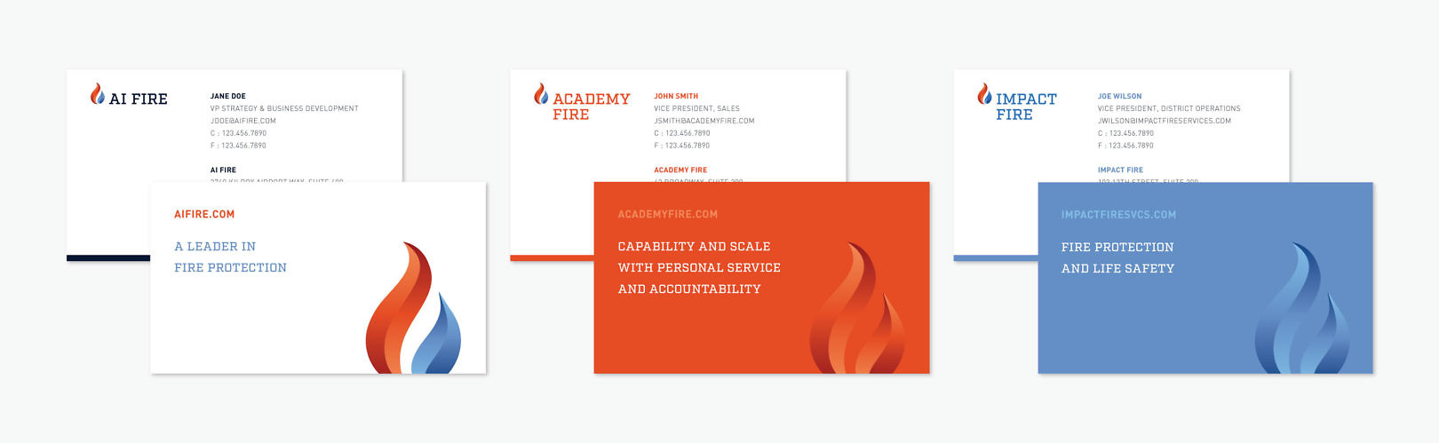

Iconography adds another layer of communication, helping to identify the wide range of services the company offers.
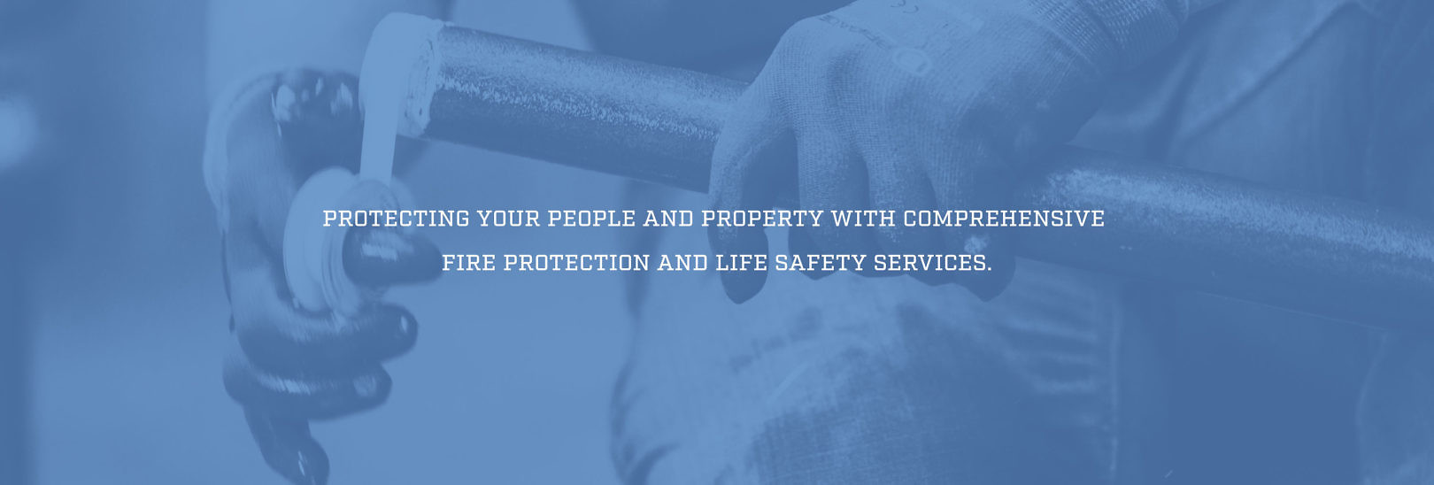
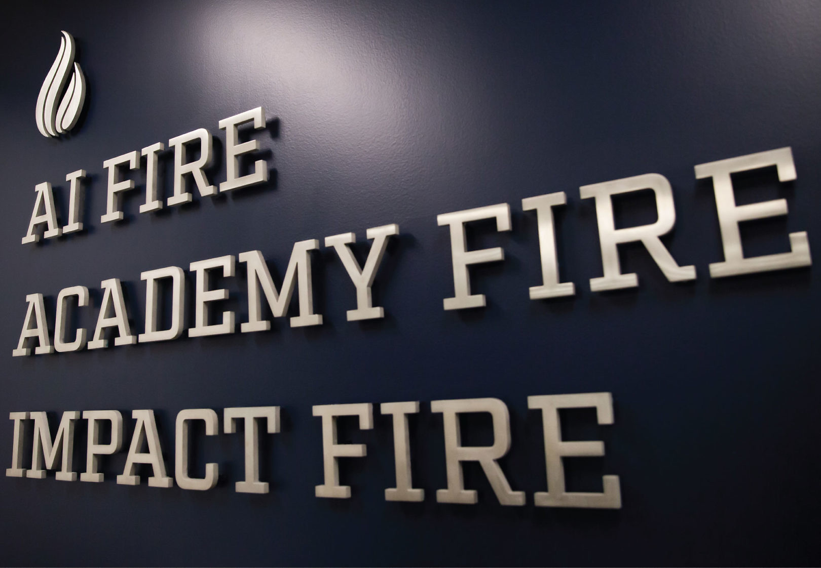
Disciplined use of the system across a variety of applications strengthens the brand’s presence in each local market it serves.